
← Khanim AzimliEditable PPTX ↓
Series

POWERPOINT,
REBUILT.

Dense business material, rebuilt as native, editable PowerPoint.

Same discipline. Very different subjects.

  1. 01From complexity
    to control
    SOX · IT Scoping
  2. 02 · This caseAI,
    prioritized.
    AI Strategy · Banking
  3. 03The pipeline is growing.
    The engine is stalling.
    Healthcare · Vaccine Innovation
PowerPoint Transformation 02
69Source slides
10Decision slides

AI,prioritized.

The source had dozens of AI possibilities.
The redesign had to decide what deserved priority.

AI StrategyBankingDecision DesignPowerPoint Transformation
Cover · noise → signal (auto build after transition)From 69 slides of possibilities to 10 slides of decisions

69 slides contained the information.
The redesign had to find the decision.

This PowerPoint transformation reframes a broad AI and banking presentation into a focused ten-slide narrative about prioritisation.

Instead of presenting every use case, statistic and framework at equal weight, the redesign keeps returning to one question:

Where should AI investment go first?

The visual system is built around filtering. The result remains a fully editable PowerPoint presentation.

MANY OPTIONSUse cases, stats, models
VALUESlides 02 · 03
FEASIBILITYSlide 04
MATURITYSlides 05 · 06
CONTROLSlides 08 · 09
PRIORITYSlide 10
Role
  • Narrative Restructuring
  • Presentation Design
  • AI Strategy Storytelling
  • Data Visualisation
  • PowerPoint Motion
  • Editable Systems
Format

10-slide PowerPoint redesign

Source

KPMG in Thailand, “You can with AI – But what should your priorities be?”, 24 April 2025. Independent redesign.

Before → After

69 slides of possibility.
10 slides of priority.

All 69 source slides, shown small
Before · 69 source slides
After · 10 decision slides
Before
  • Many AI statistics
  • Many use cases
  • Many frameworks
  • Many opportunities
After
  • One decision
    story.

Same data.
Clearer decision.

Seven transformations. Drag each divider to compare the source page with the redesigned slide. Every after is an actual slide from the finished PPTX.

01

StatisticsTensionThe value isn’t the question.

Ten percentages sat in donuts at equal weight. The redesign keeps two forces: the promise and the pressure. They meet at the decision the rest of the deck answers.
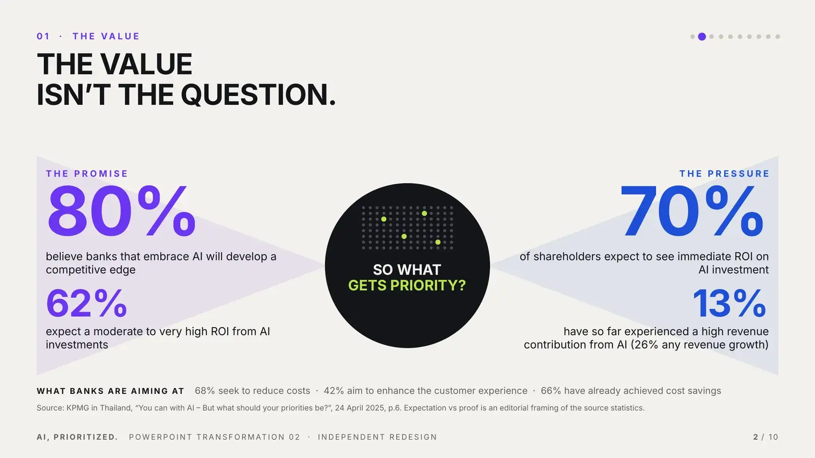
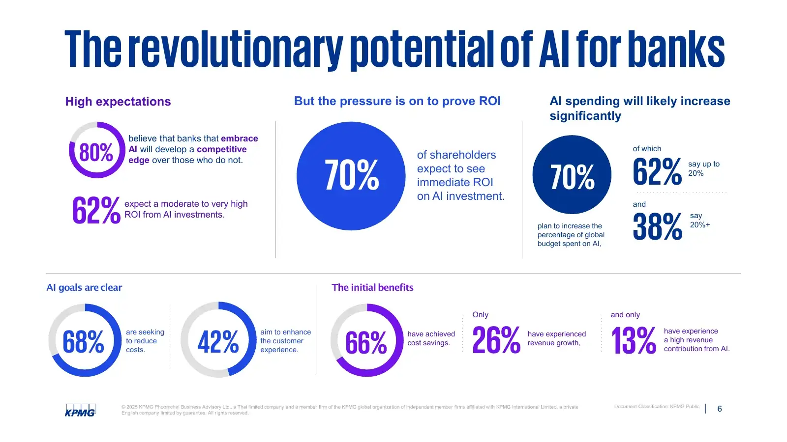
After: the promise versus the pressure, meeting at SO WHAT GETS PRIORITY?
Before: The revolutionary potential of AI for banks, five donuts and ten percentages
BEFORE · SOURCE P.6AFTER · SLIDE 02
80%
believe banks that embrace AI will develop a competitive edge
SO WHATGETS PRIORITY?
70%
of shareholders expect to see immediate ROI on AI investment
02

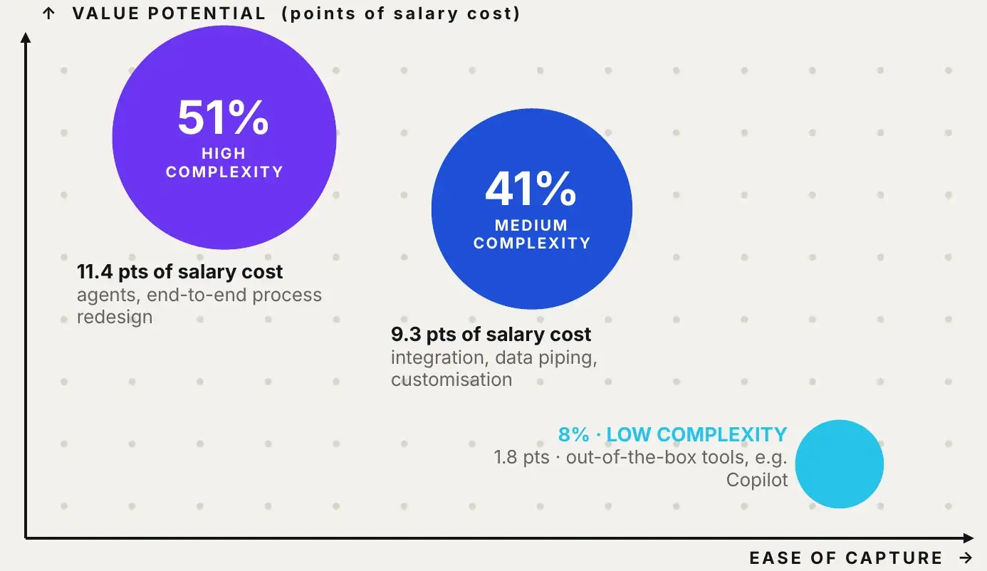
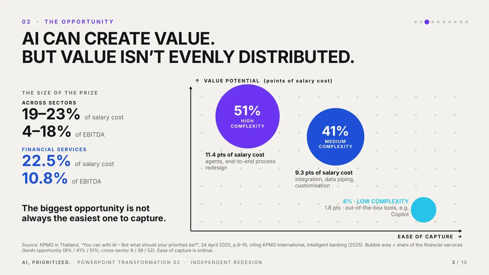
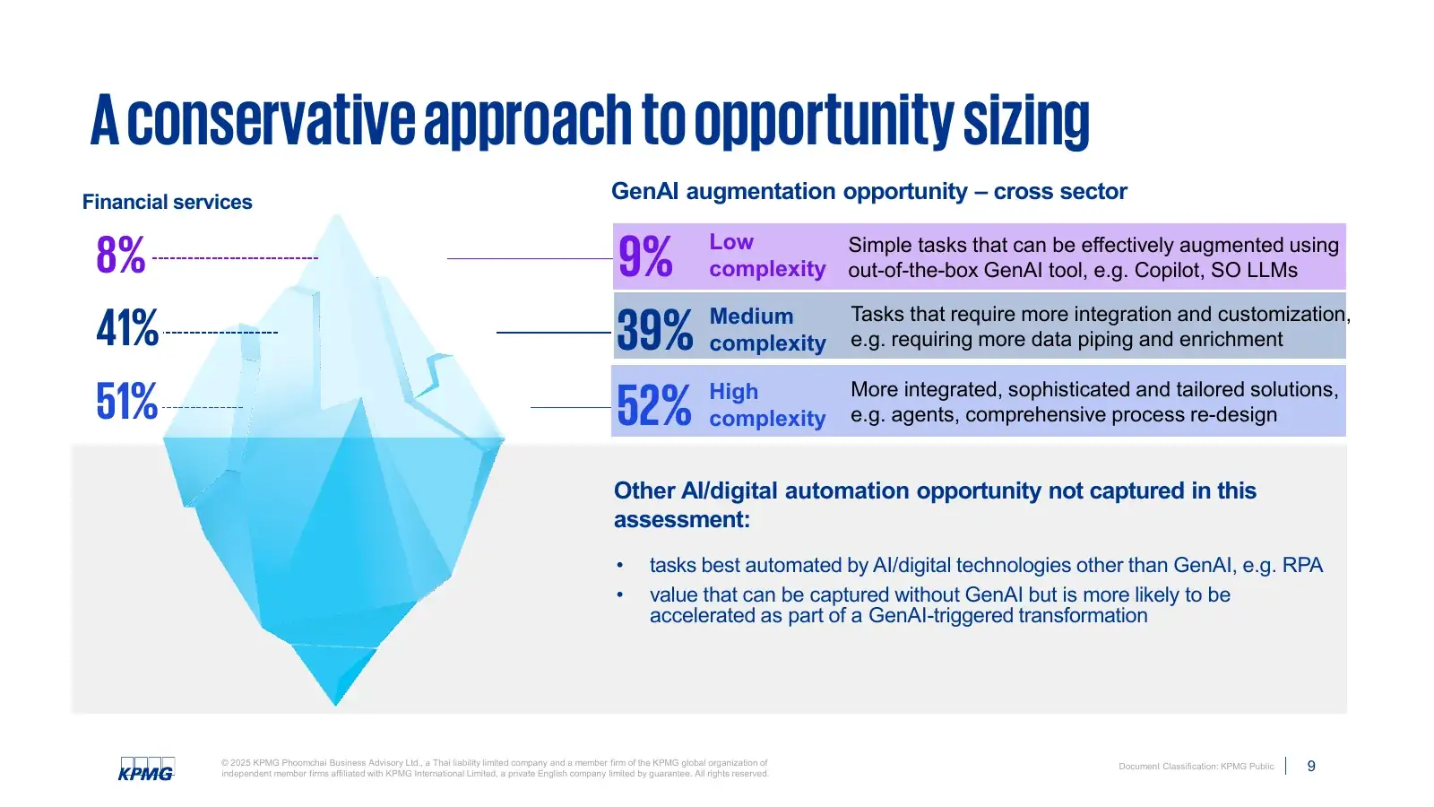
Opportunity sizeValue vs easeAI can create value. But value isn’t evenly distributed.

An iceberg metaphor became a priority field. Bubble area is the share of the opportunity; height is points of salary cost. The largest opportunity is not always the easiest one to capture.

After: priority field plotting ease of capture against value potential
Before: A conservative approach to opportunity sizing, an iceberg with three complexity bands
BEFORE · SOURCE P.9AFTER · SLIDE 03
03

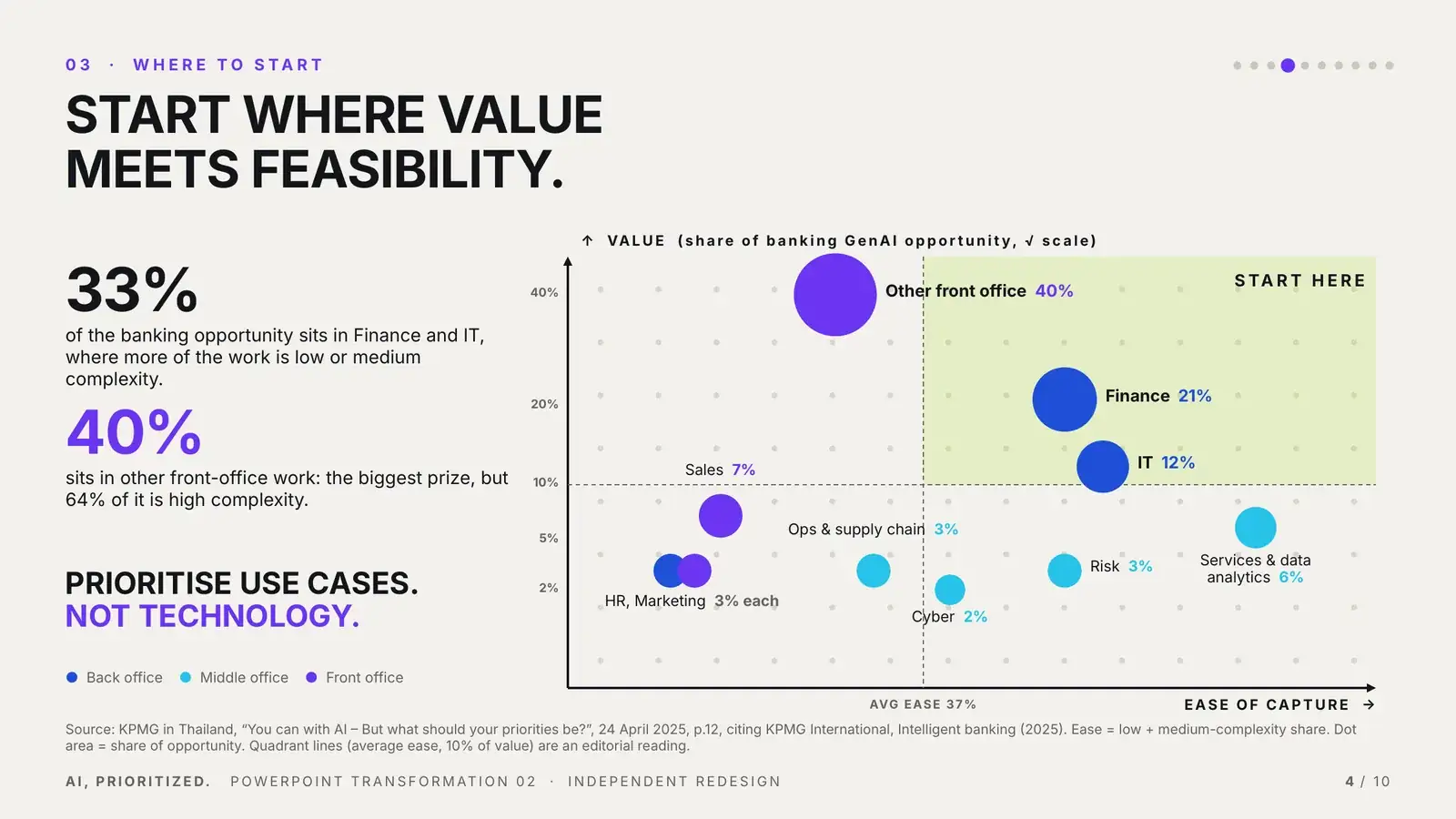
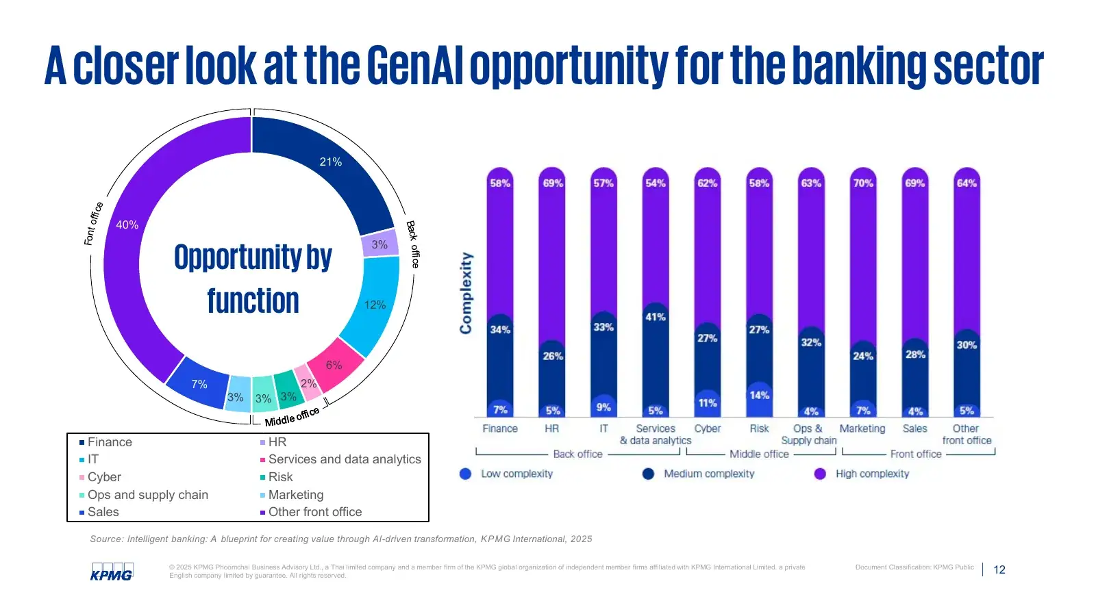
Function listDecision fieldStart where value meets feasibility.

A donut and ten stacked bars became one field. The redesign turns opportunity sizing into a prioritisation question.

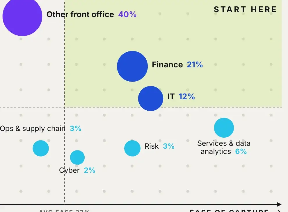
After: banking functions plotted by value and ease, with a START HERE zone
Before: opportunity by function, donut and stacked complexity bars
BEFORE · SOURCE P.12AFTER · SLIDE 04
Detail: Finance and IT inside the START HERE zone, Other front office above the average-ease line
Finance + IT33% of the banking opportunity, with more low and medium complexity work. Start here.
Other front office40% of the opportunity: the biggest prize, but 64% of it is high complexity.
04

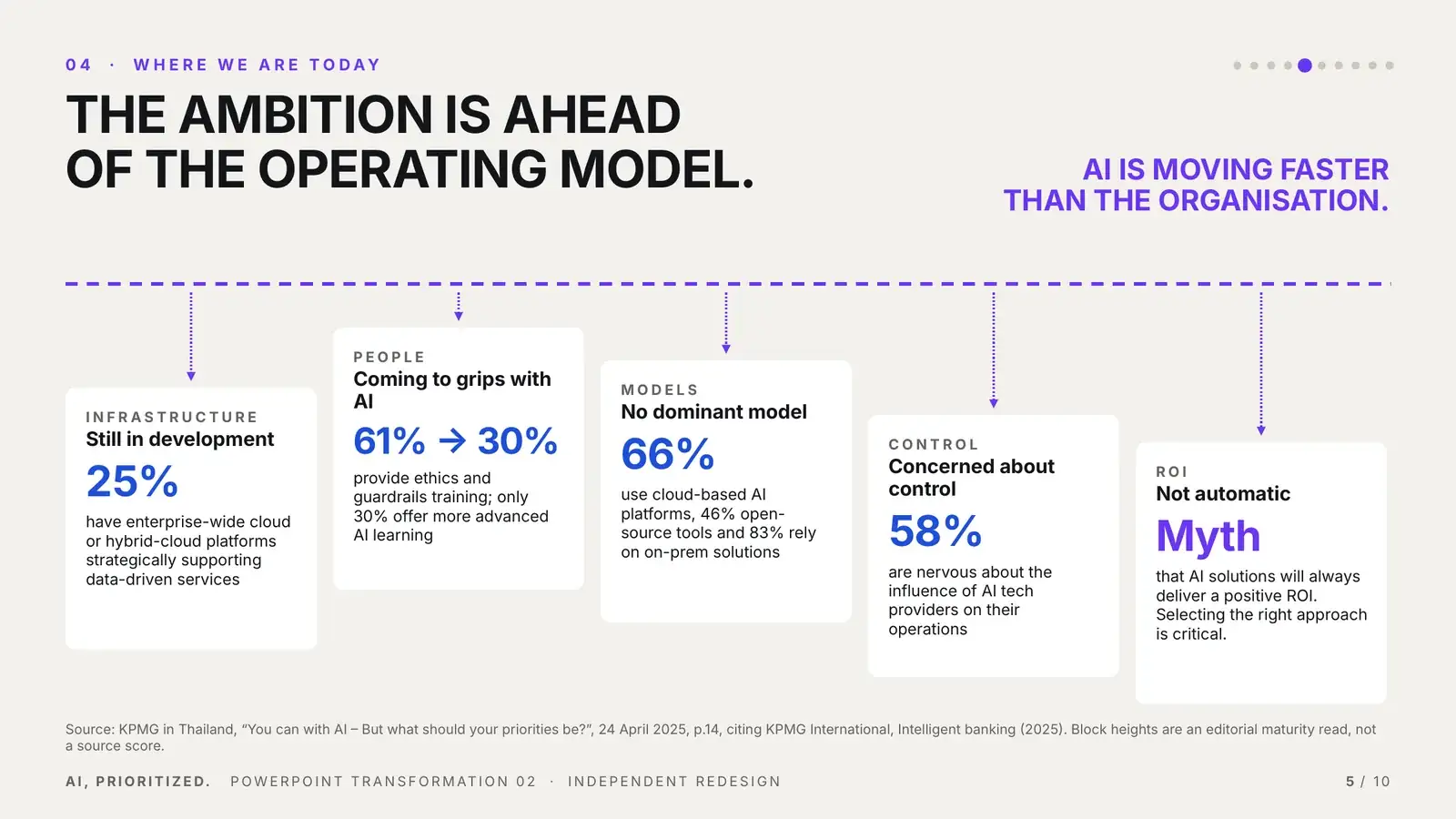
ObservationsMaturity gapThe ambition is ahead of the operating model.

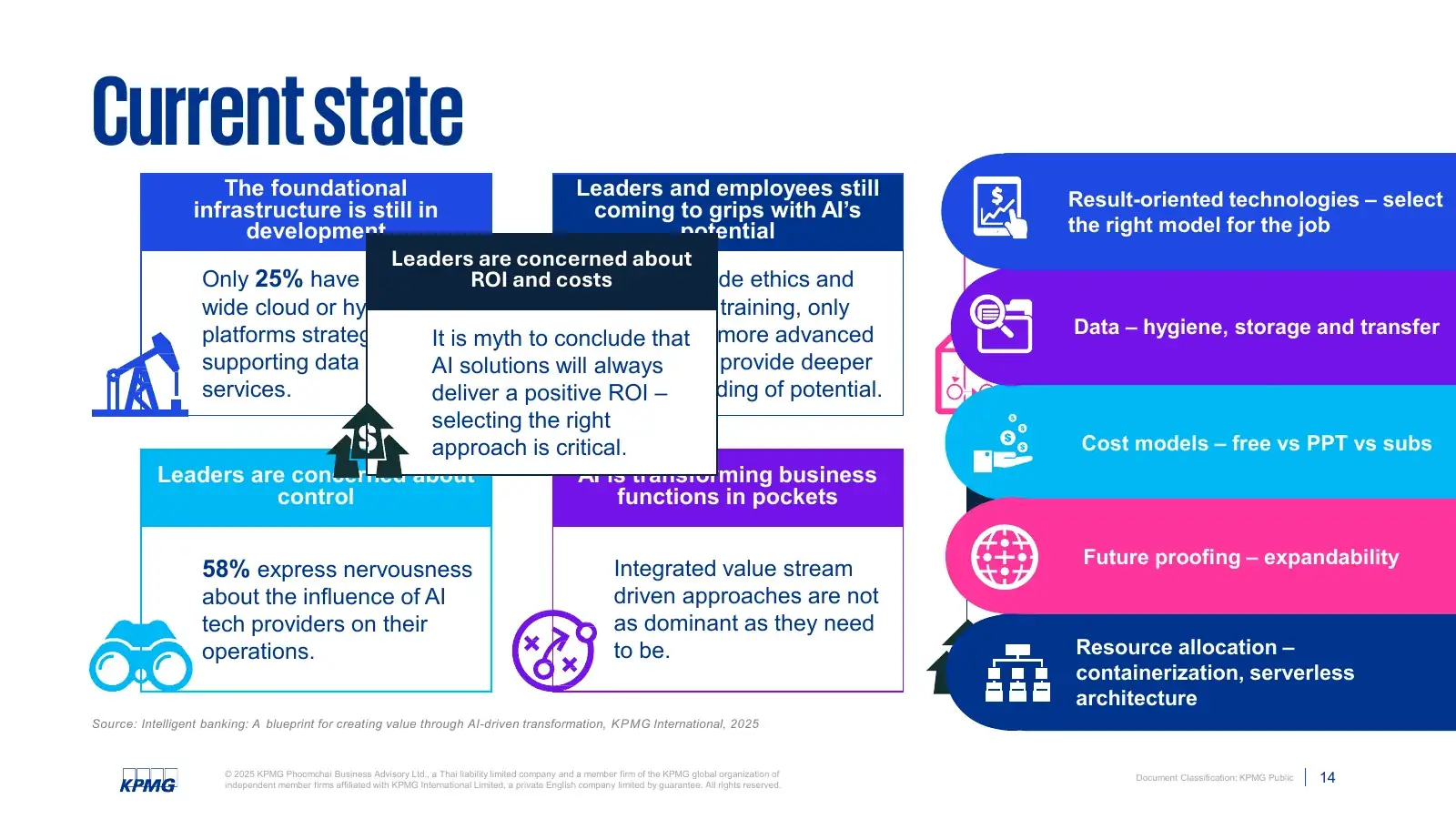
Infrastructure, people, models, control and ROI were scattered across overlapping boxes. The redesign stages them as one system under one ambition line, so the gap becomes the point.

After: five operating-model blocks at different heights below a dashed ambition line
Before: Current state, overlapping blocks, icons and a side list
BEFORE · SOURCE P.14AFTER · SLIDE 05
05

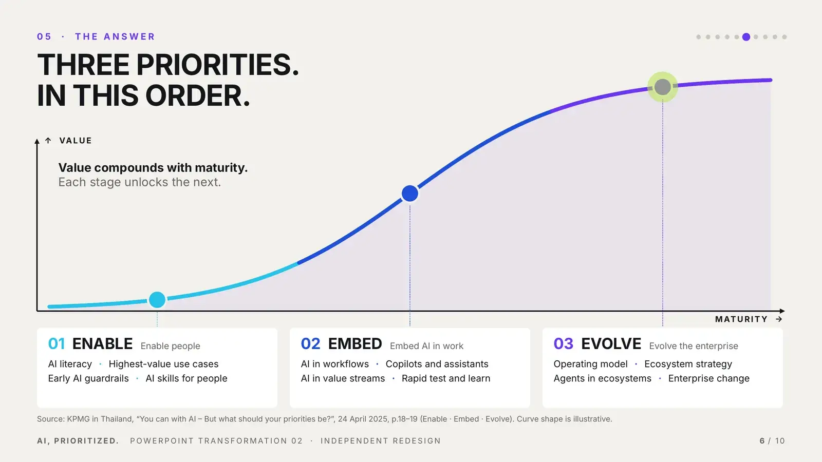
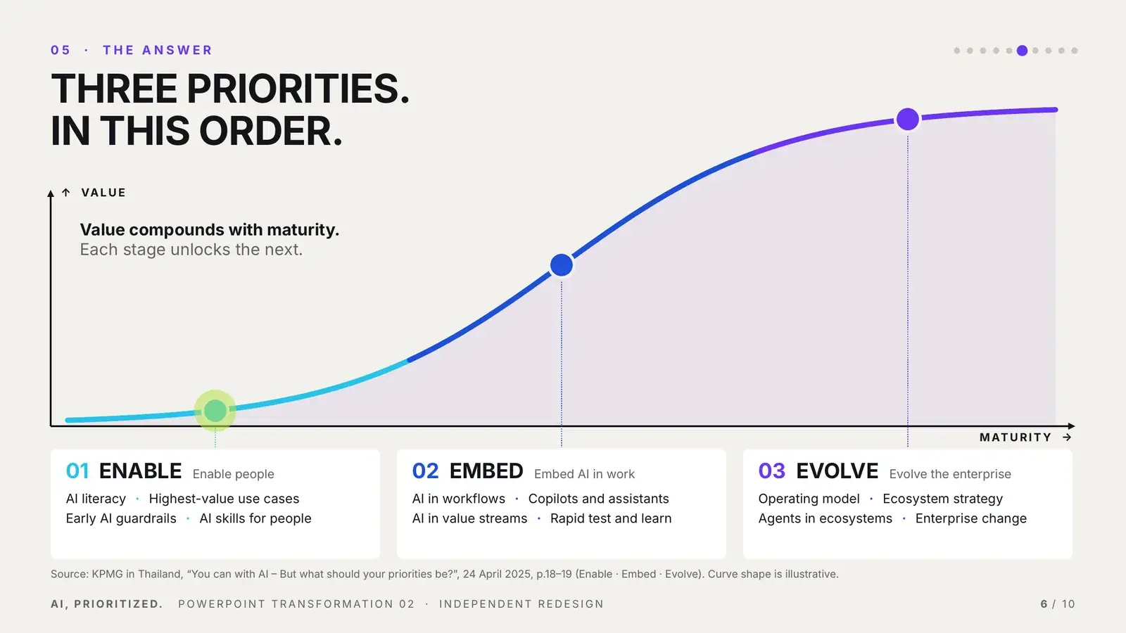
FrameworkJourneyThree priorities. In this order.

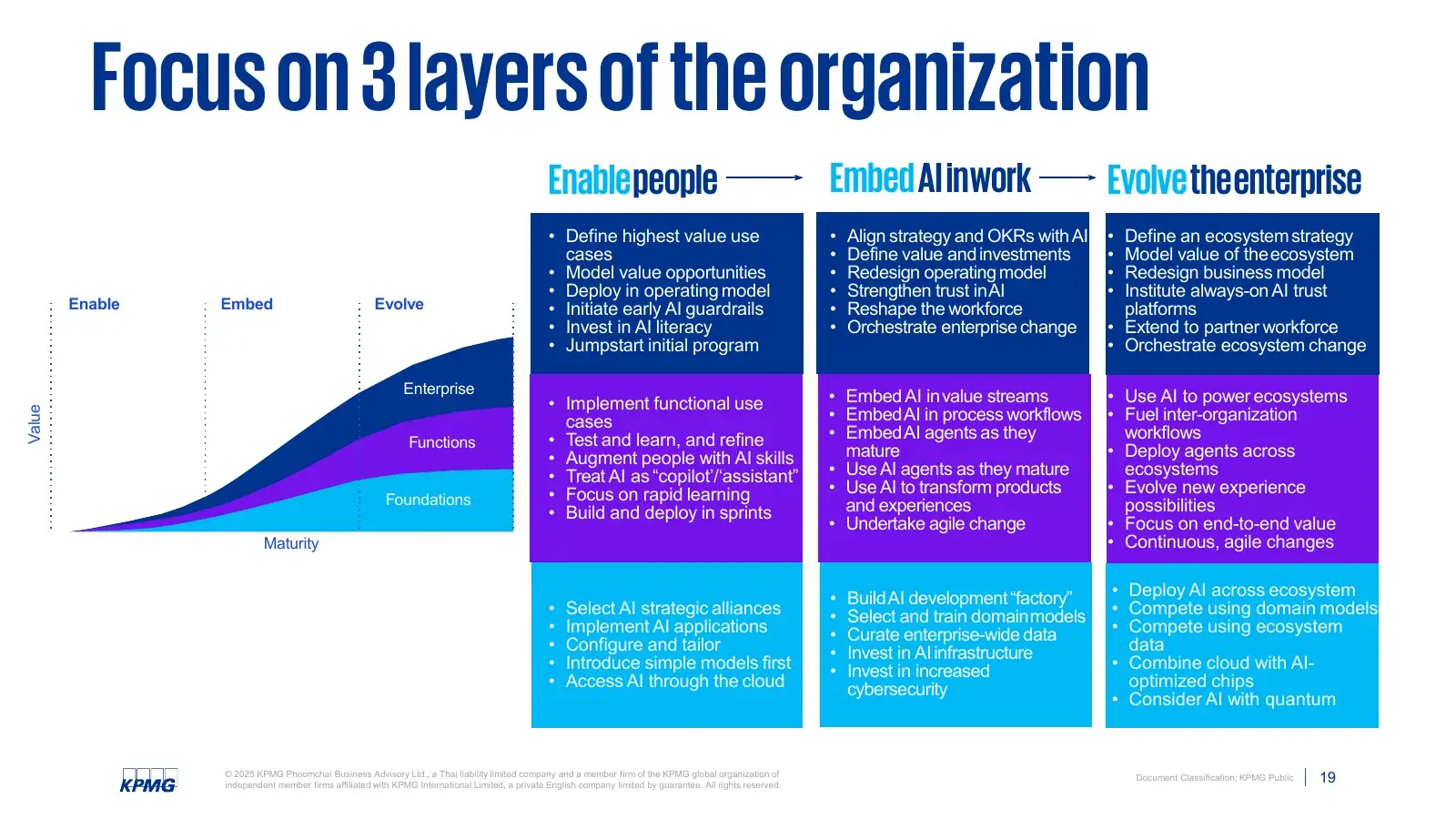
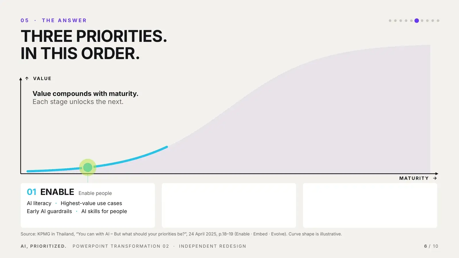
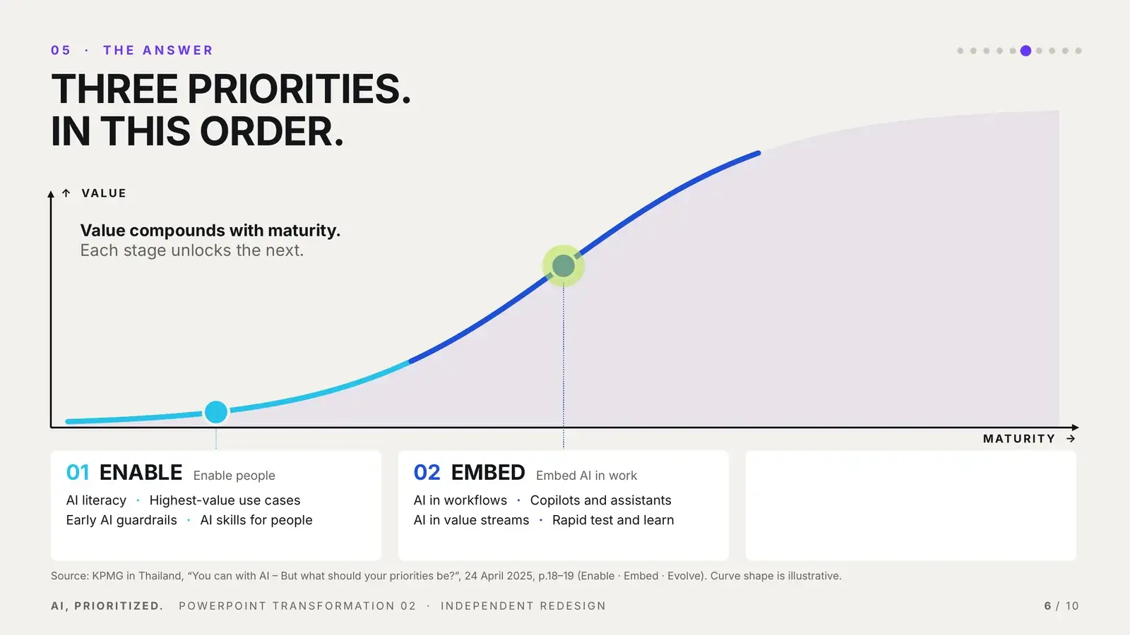
Three dense columns and more than fifty bullets became one maturity curve. Each click draws the next stage and moves the marker along the curve: Enable, then Embed, then Evolve.

After: one S-curve rising in value and maturity with Enable, Embed, Evolve
Before: Focus on 3 layers of the organization, three dense bullet columns
BEFORE · SOURCE P.19AFTER · SLIDE 06
Enable → Embed → EvolveStrategy shown as a progression, not a static table. Three clicks, three curve segments, one motion path.
06

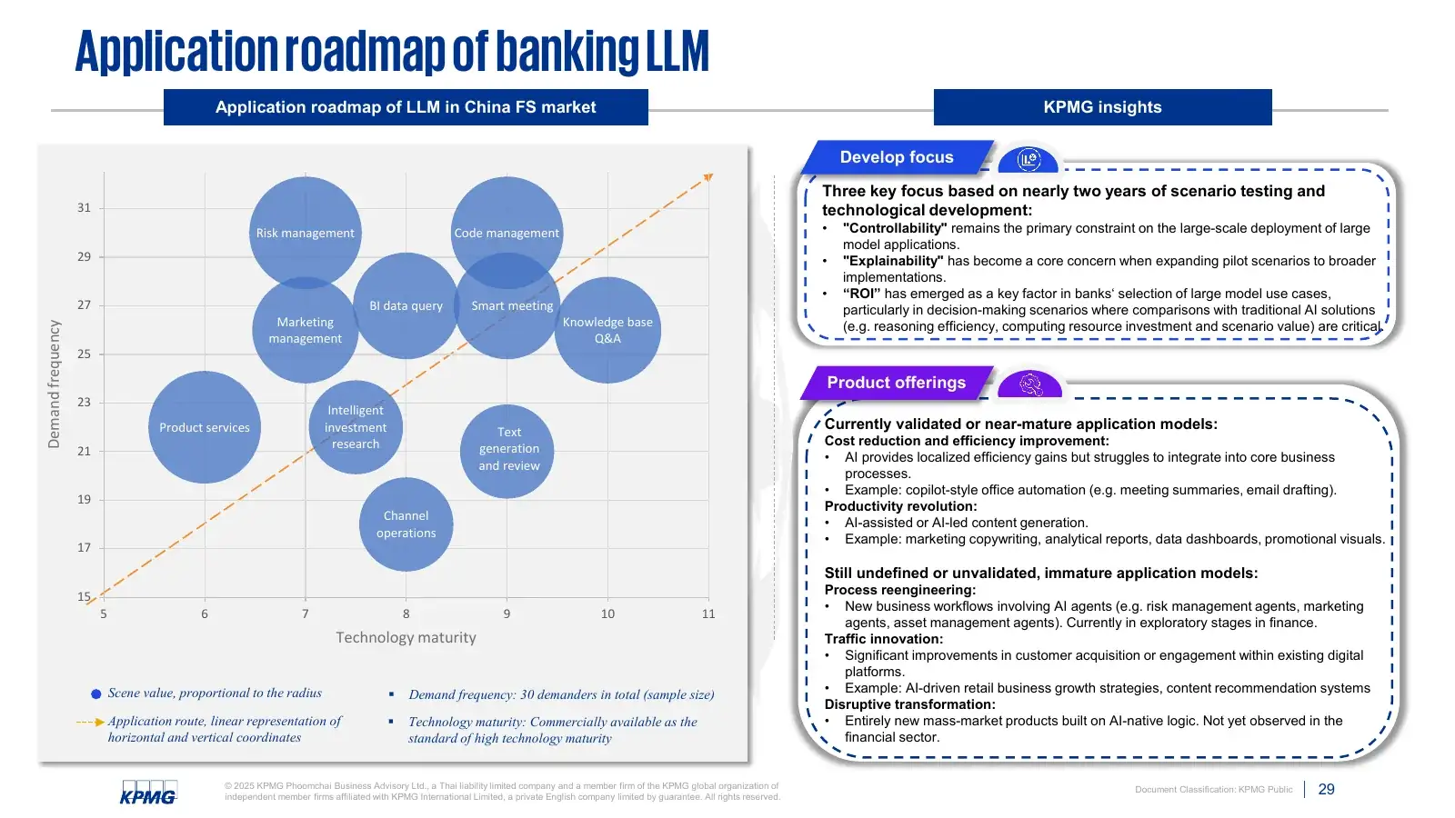
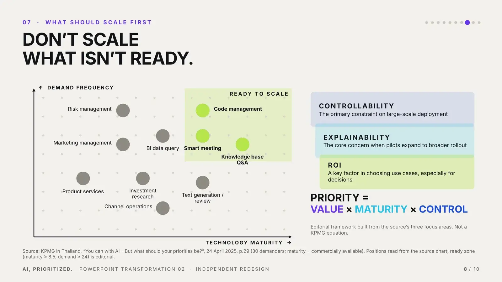
ChartDecision modelDon’t scale what isn’t ready.

Overlapping bubbles and two text sidebars became a maturity matrix with a ready zone and the source’s three filters layered beside it.

After: maturity and demand matrix with READY TO SCALE zone and three filters
Before: Application roadmap of banking LLM, bubble chart and dense sidebars
BEFORE · SOURCE P.29AFTER · SLIDE 08
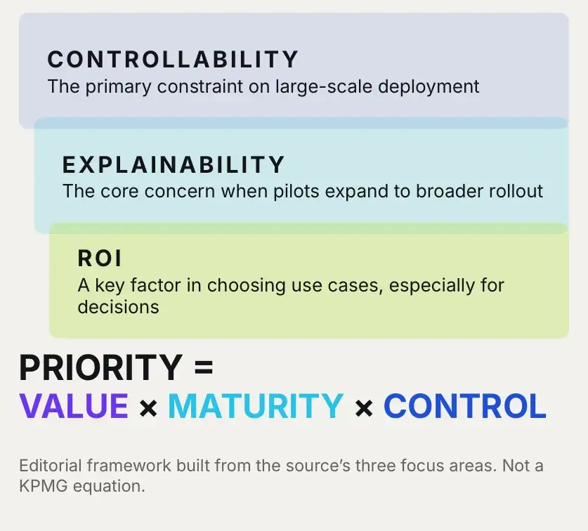
Detail: Controllability, Explainability and ROI filters above the PRIORITY formula
CONTROLLABILITY
EXPLAINABILITY
ROI
The three focus areas from the source become filters a use case has to pass.
PRIORITY = VALUE × MATURITY × CONTROLEditorial framework · not a source equation
07

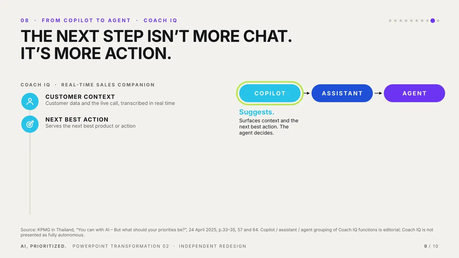
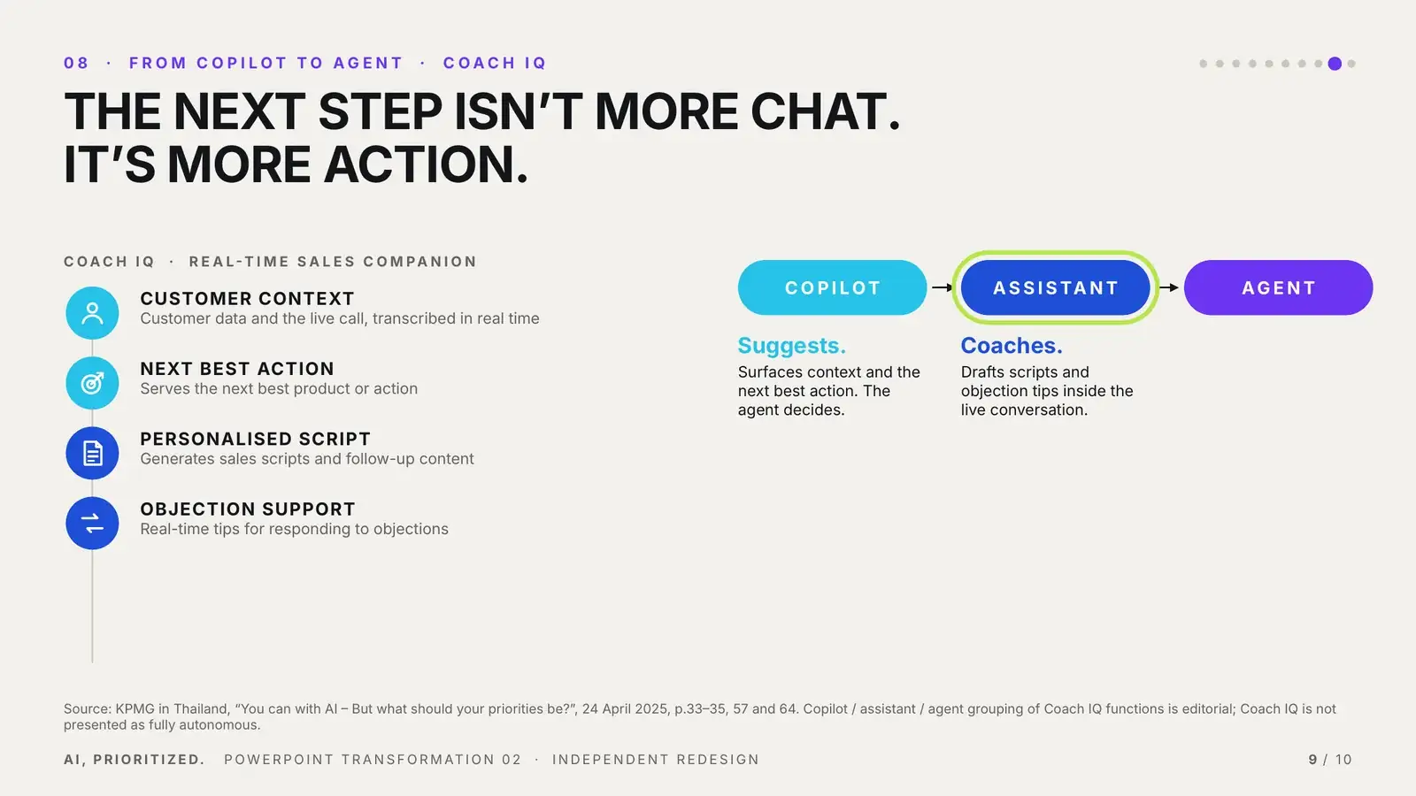
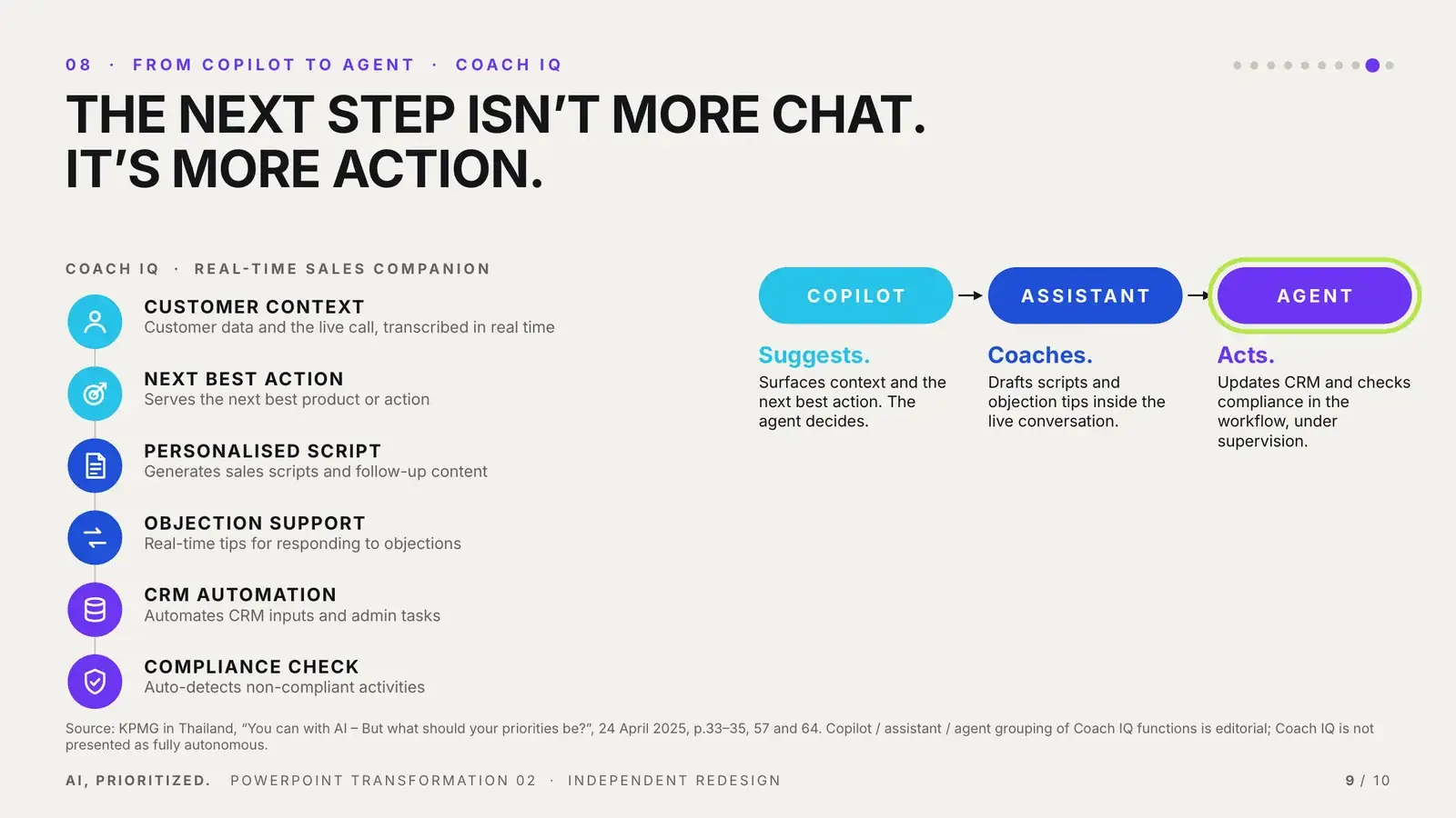
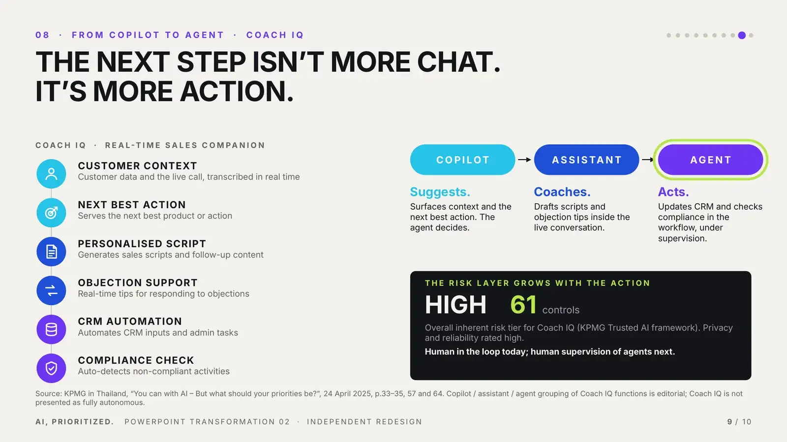
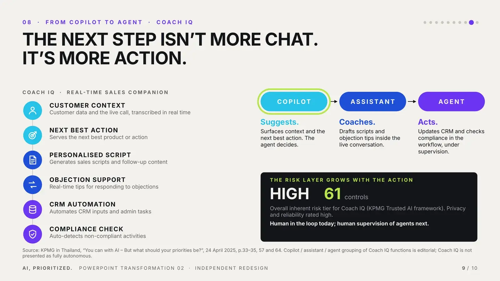
Feature listCapability evolutionThe next step isn’t more chat. It’s more action.

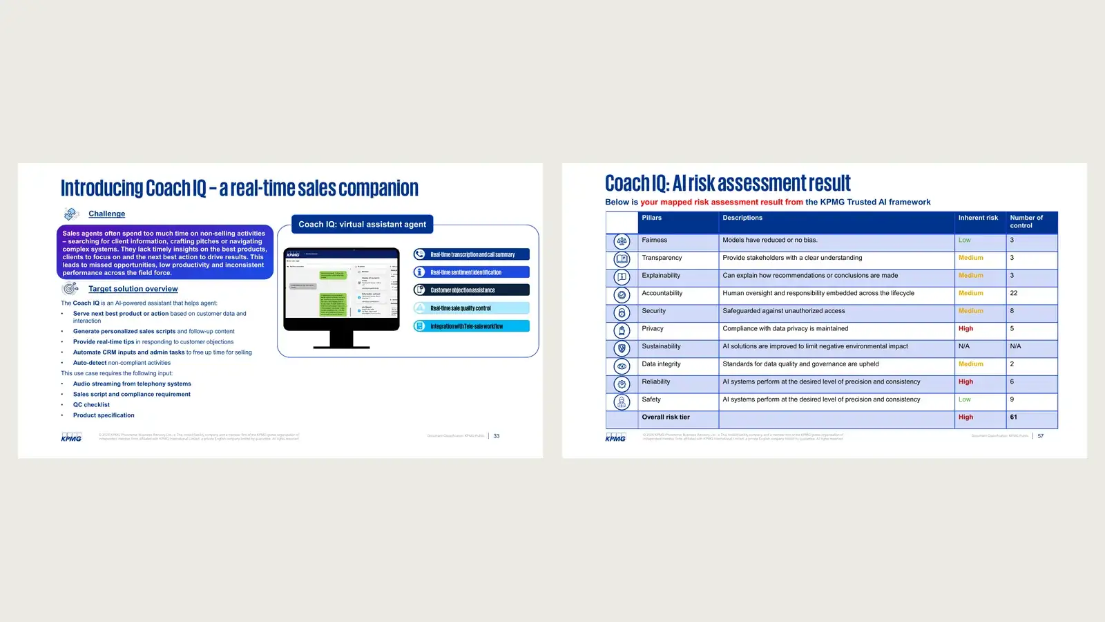
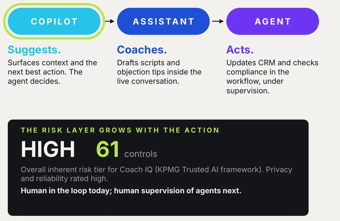
Coach IQ’s features and its AI risk assessment were separate sections. The redesign connects them: copilot, then assistant, then agent, and the risk layer grows as AI becomes more action-oriented.

After: six Coach IQ functions mapped to copilot, assistant and agent, with a risk layer
Before: Coach IQ feature page and the separate risk assessment table
BEFORE · SOURCE P.33 + P.57AFTER · SLIDE 09
Detail: COPILOT, ASSISTANT, AGENT with the risk layer: HIGH, 61 controls
Suggests → Coaches → ActsGrouping drawn from Coach IQ’s own functions. No claim of full autonomy.
HIGH · 61 controlsOverall inherent risk tier from the source’s Trusted AI assessment. More action, more control.

What changed

Don’t show everything AI can do. Show what should come first.

Content

Many AI possibilities→ one prioritisation question

Data

Statistics→ decision logic

Structure

Frameworks→ journey

Visual language

AI topics→ filtering and prioritisation system

Motion

Static explanation→ progressive reasoning

Format

69-slide corporate deck→ 10-slide editable PowerPoint story

Motion carries
the reasoning.

Clicks reveal one step of logic at a time, and Morph moves the same named objects from one slide to the next, so the audience sees the idea change rather than a new slide appear.

Slide 09 · 4 clicks · motion pathCopilot → assistant → agent → riskThe lime marker travels along the stages; matching functions light up.
Slide 06 · 3 clicks · wipe + motion pathEnable → embed → evolveThe curve draws itself in three segments as the marker climbs.
Morph frame A, slide 03Morph frame B, slide 04
03 → 04Signal → priorityComplexity bubbles become banking functions.
Morph frame A, slide 05Morph frame B, slide 06
05 → 06Fragments → pathFive blocks resolve into three stages.
Morph frame A, slide 07Morph frame B, slide 08
07 → 08Path → matrixUse cases travel into the maturity field.
Morph frame A, slide 09Morph frame B, slide 10
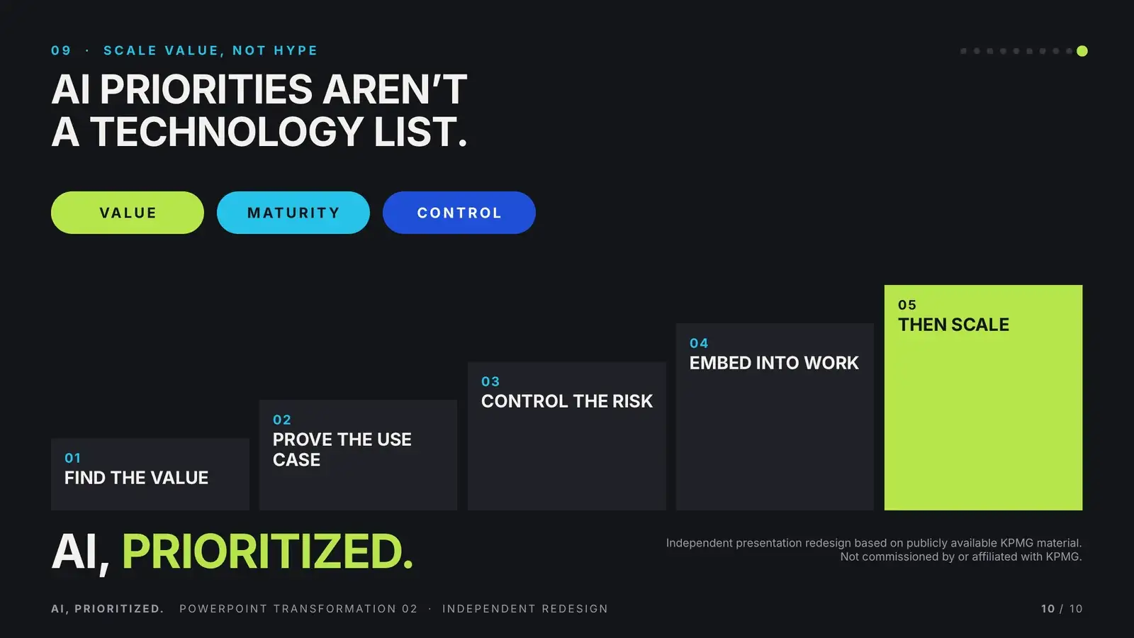
09 → 10Agent → filtersStage pills become value, maturity, control.
PowerPoint craft

Built to
make decisions.

Every major visual remains editable. The redesign is not a static image exercise. It is still a working presentation system.

Cover layoutData story layoutMatrix layoutFramework layoutCase study layoutClosing layout
01MASTER

Six named layouts: Cover, Data story, Matrix, Framework, Case study, Closing. Headline and section label are real placeholders; palette and Aptos live in the theme.

// same name on both slides = Morph pairs them
!!sig1 → 51% bubble → Other front office
!!sig2 → 41% bubble → Finance
!!blk1…5 → stage cards 01–03
!!uc_kqa → Knowledge Q&A node → matrix dot
!!pill1…3 → Copilot · Assistant · Agent → Value · Maturity · Control
// 9 Morph transitions · 749 named objects
02MORPH

Used where an idea changes state, not as a slide effect. The signal dots carry the thread from the cover to the decision field.

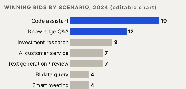
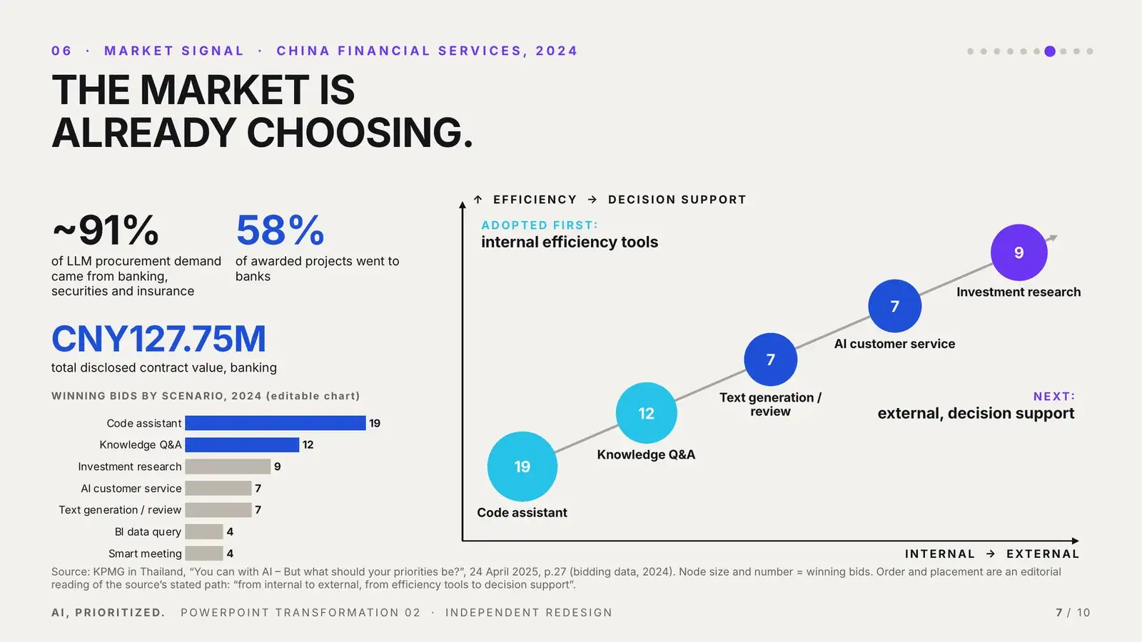
Native bar chart: winning bids by scenario
03EDITABLE DATA

Winning bids by scenario is a native PowerPoint chart with its own data sheet.

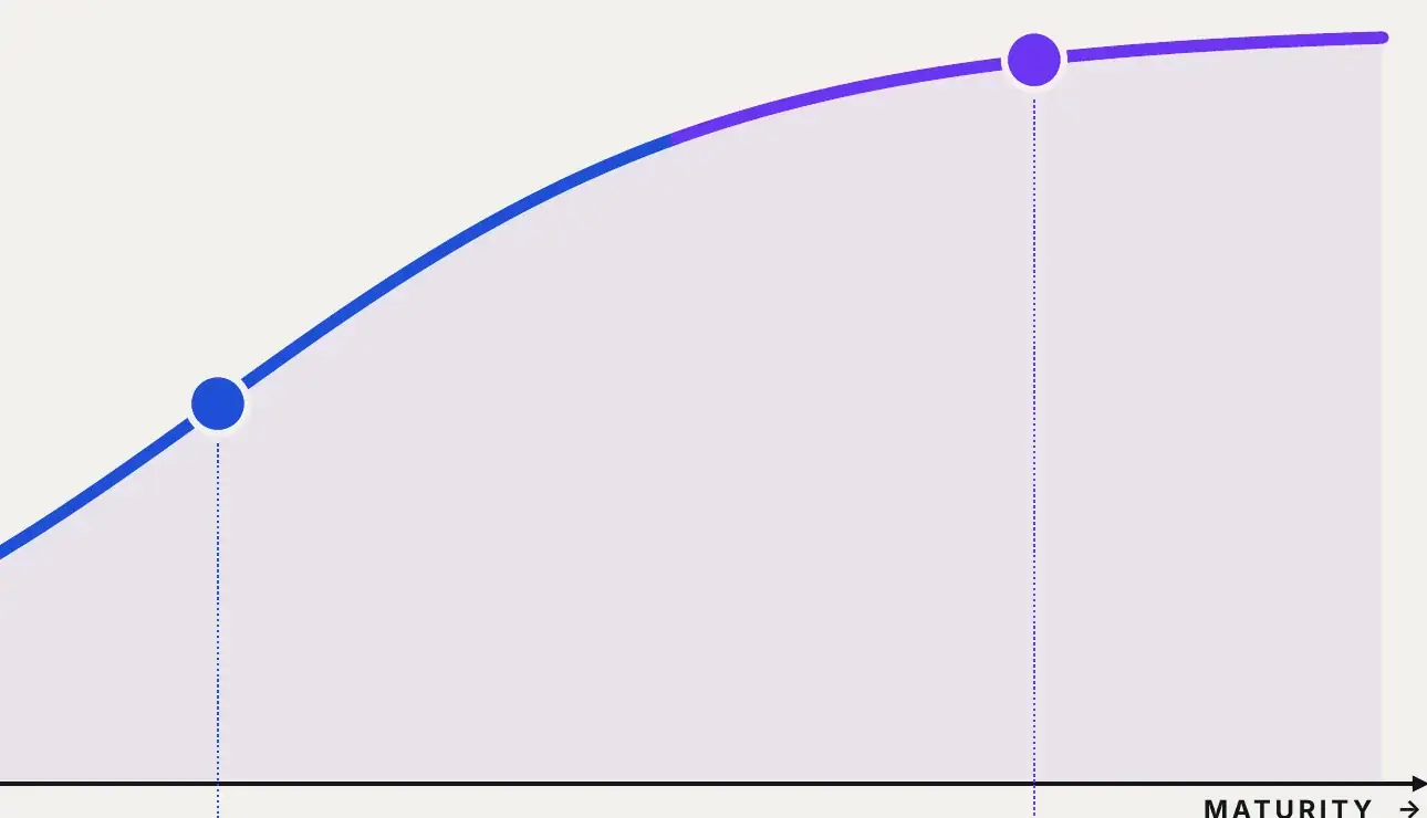
Native freeform maturity curve
04NATIVE SHAPES

The maturity curve is three editable freeform segments. Nothing is flattened; every word is live text.

Priority field built from native shapes
05MATRIX

One field reused across slides 03, 04 and 08: axes, dot grid and bubbles sized from the source data.

Slide 03 with the drawing guides shown
06GRID

Margins, text column, plot edge and footer are saved as drawing guides in the file, so new slides land in the same places.

07MOTION

110 animation steps: Fade, Wipe, Appear, Grow and two Motion Paths. Each reveals one step of the logic.

SOFT BONE · #F3F1ECDEEP CHARCOAL · #14151AELECTRIC PURPLE · AIBANKING BLUE · BUSINESSVIVID CYAN · DATASIGNAL LIME · PRIORITY

Built in PowerPoint.
Not limited by it.

AI priorities
aren’t a
technology list.

VALUEMATURITYCONTROL

PowerPoint Transformation Study 02

Independent redesign exercise based on publicly available KPMG material: KPMG in Thailand, “You can with AI – But what should your priorities be?”, 24 April 2025. Not commissioned by or affiliated with KPMG. Source pages are shown for comparison only. The PDF preview shows slides in their final build state; open the PPTX in PowerPoint to see Morph and animation.