Design thatleavesthe screen.
Books, learning systems, annual publications and cultural print.
Textbooks used in classrooms across Azerbaijan. A school yearbook designed five years running. Print for two school theatre productions.
Each has a different reader: a student moving through a lesson, a family keeping a year, an audience waiting for the curtain. The page system is built around that reader.
A · Educational publishing · the four printed textbooks
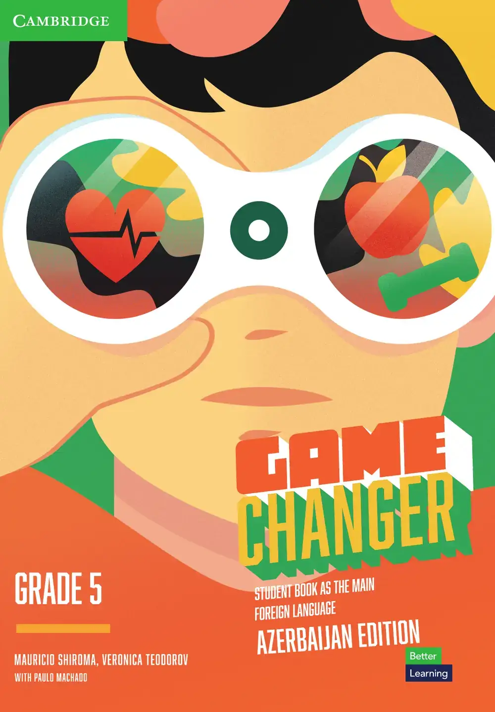
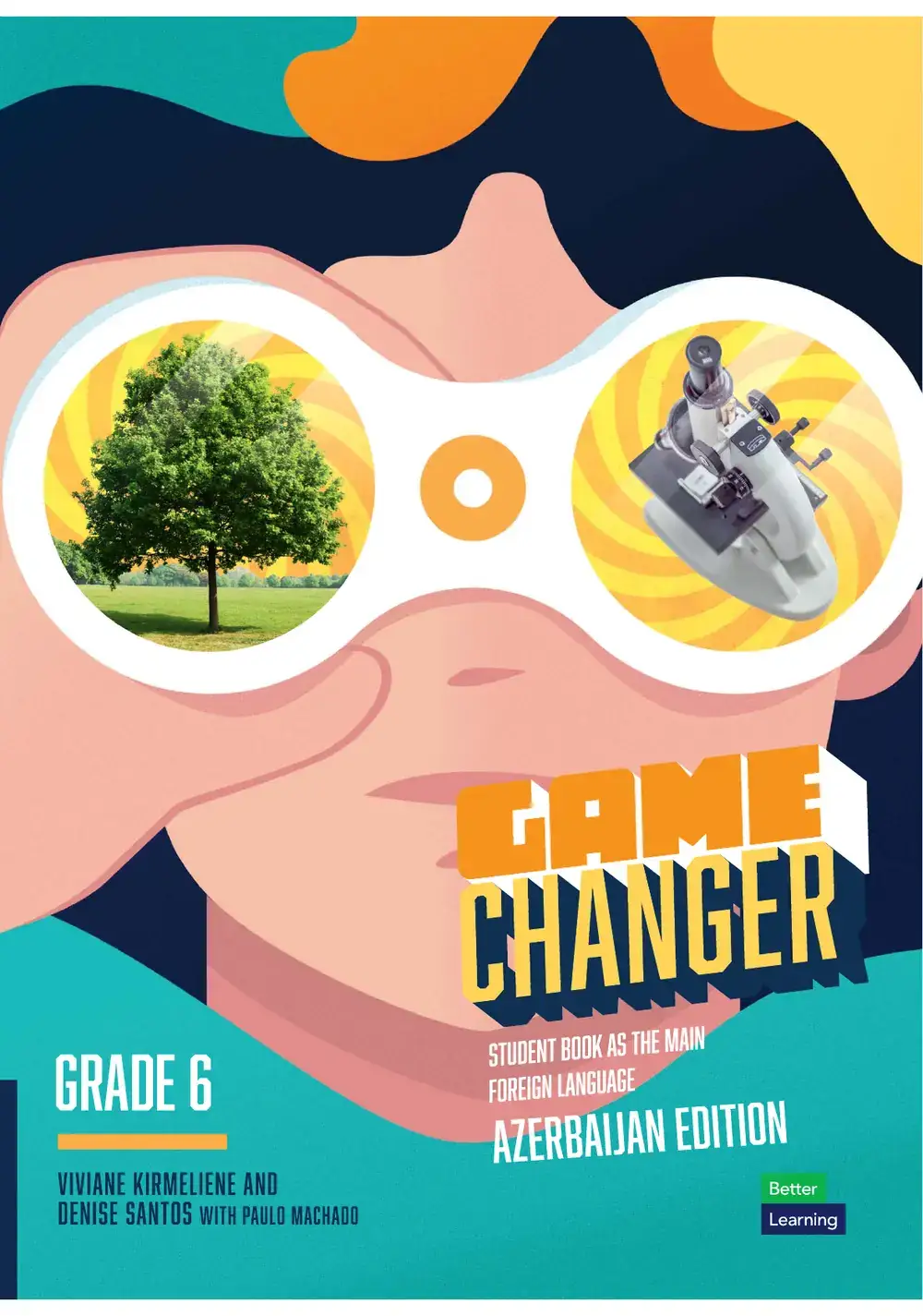
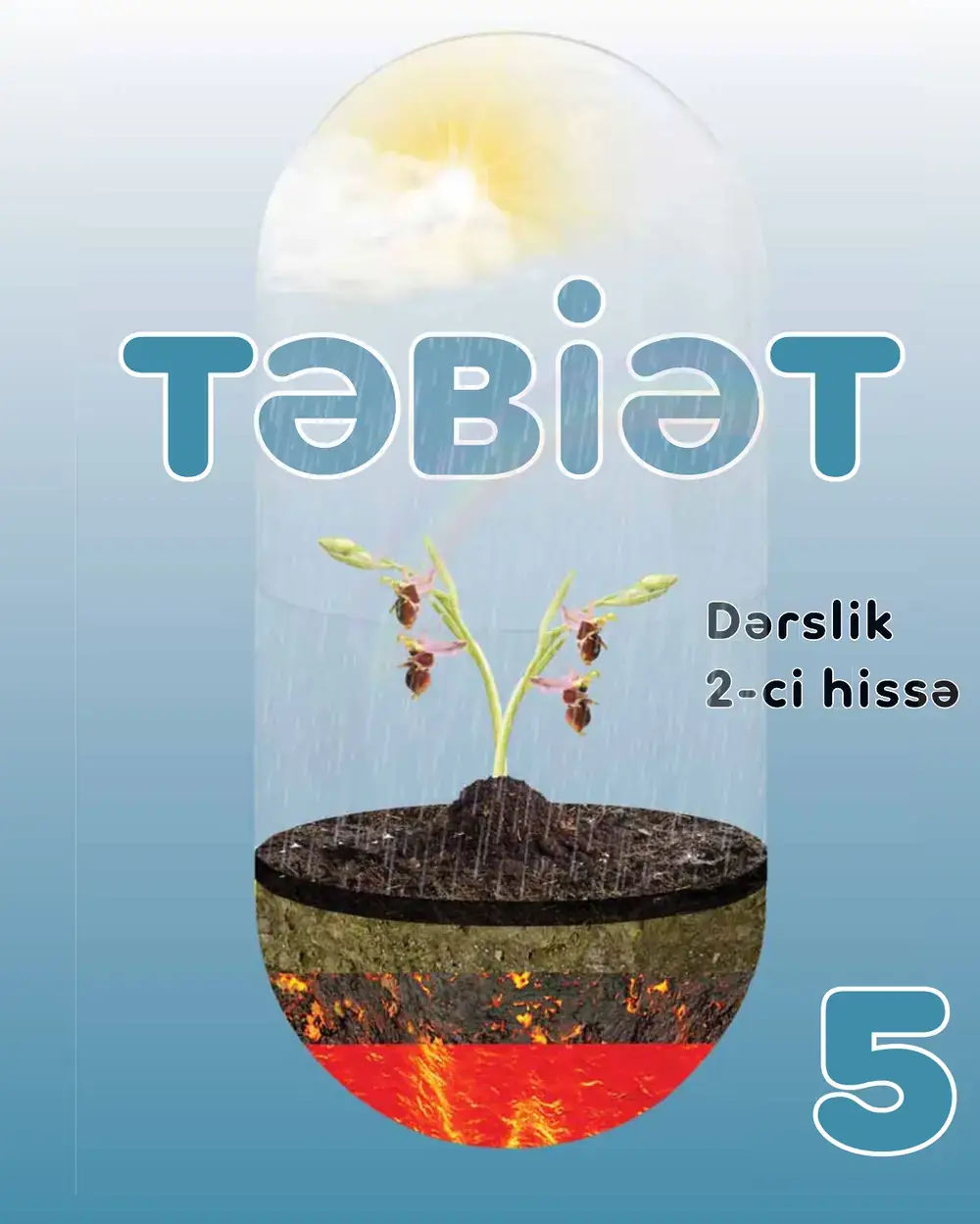
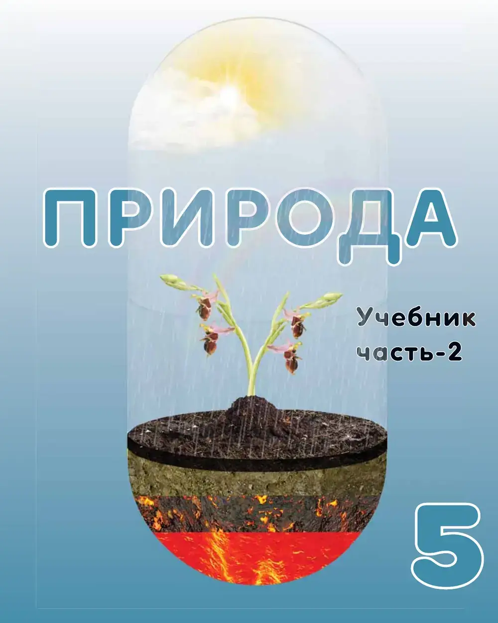
| Edition | Grade | Language | Year | Print run | ||
|---|---|---|---|---|---|---|
| Game Changer, Azerbaijan Edition | Grade 5 | English | 2024 | 148,050 | ||
| Game Changer, Azerbaijan Edition | Grade 6 | English | 2025 | 152,500 | ||
| Təbiət 5, part 2 | Grade 5 | Azerbaijani | 2022 | 152,775 | ||
| Природа 5, part 2 | Grade 5 | Russian | 2022 | 16,485 | ||
| Printed copies, four editions | 469,810 | |||||
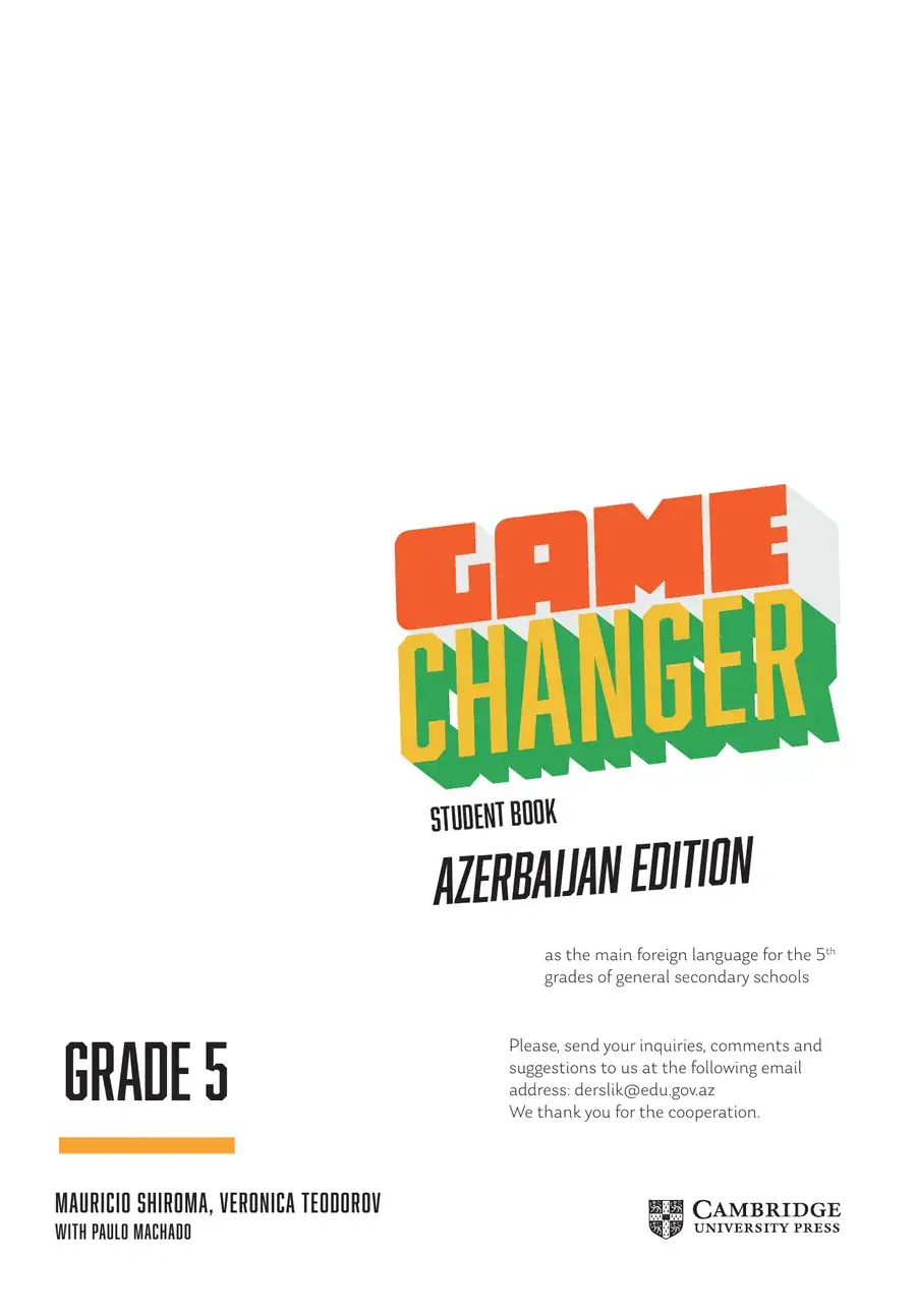
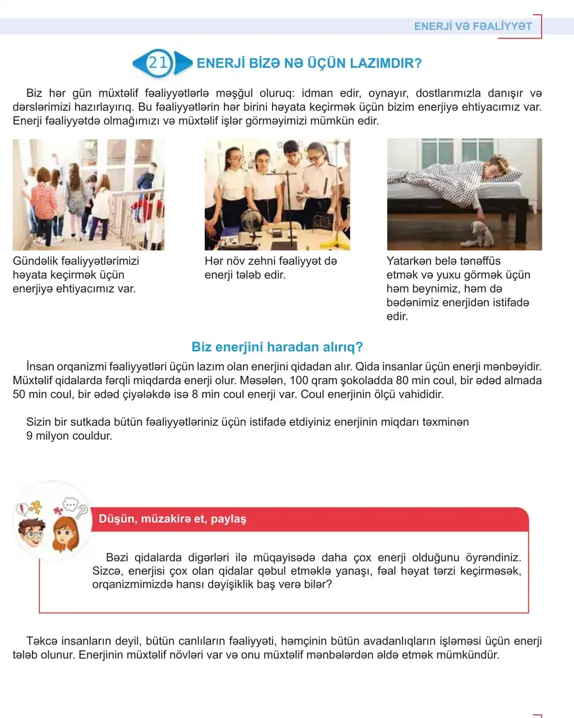
Game Changer
Azerbaijan Edition
Adapting an international learning system for a national classroom.
Game Changer was developed as an international English-learning series and adapted into an Azerbaijan edition.
The challenge was not simply translation. The Azerbaijani edition needed to preserve the structure, visual logic and learning rhythm of the original material while working naturally within the requirements of the local educational context.
- Series
- Game Changer Student’s Book
- Edition
- Azerbaijan edition, main foreign language
- Original publisher
- Cambridge University Press & Assessment
- Adapted for print by
- Educational Institute of the Republic of Azerbaijan
- Volumes
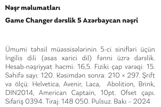
- Grade 5 · 120 pages · 2024
Grade 6 · 128 pages · 2025 - Production
- 210 × 297 mm · offset print · distributed free
An international learning system, adapted for a national classroom.
My role focused on translating a complex existing publishing system into a coherent local edition, working across page layout, content hierarchy, visual consistency and print-ready production.
Print run · Grade 5 Azerbaijan Edition · 2024
148,050
copiesGrade 5 Azerbaijan Edition
A design decision repeated across more than one hundred thousand books.
One book.
Multiple learning systems.
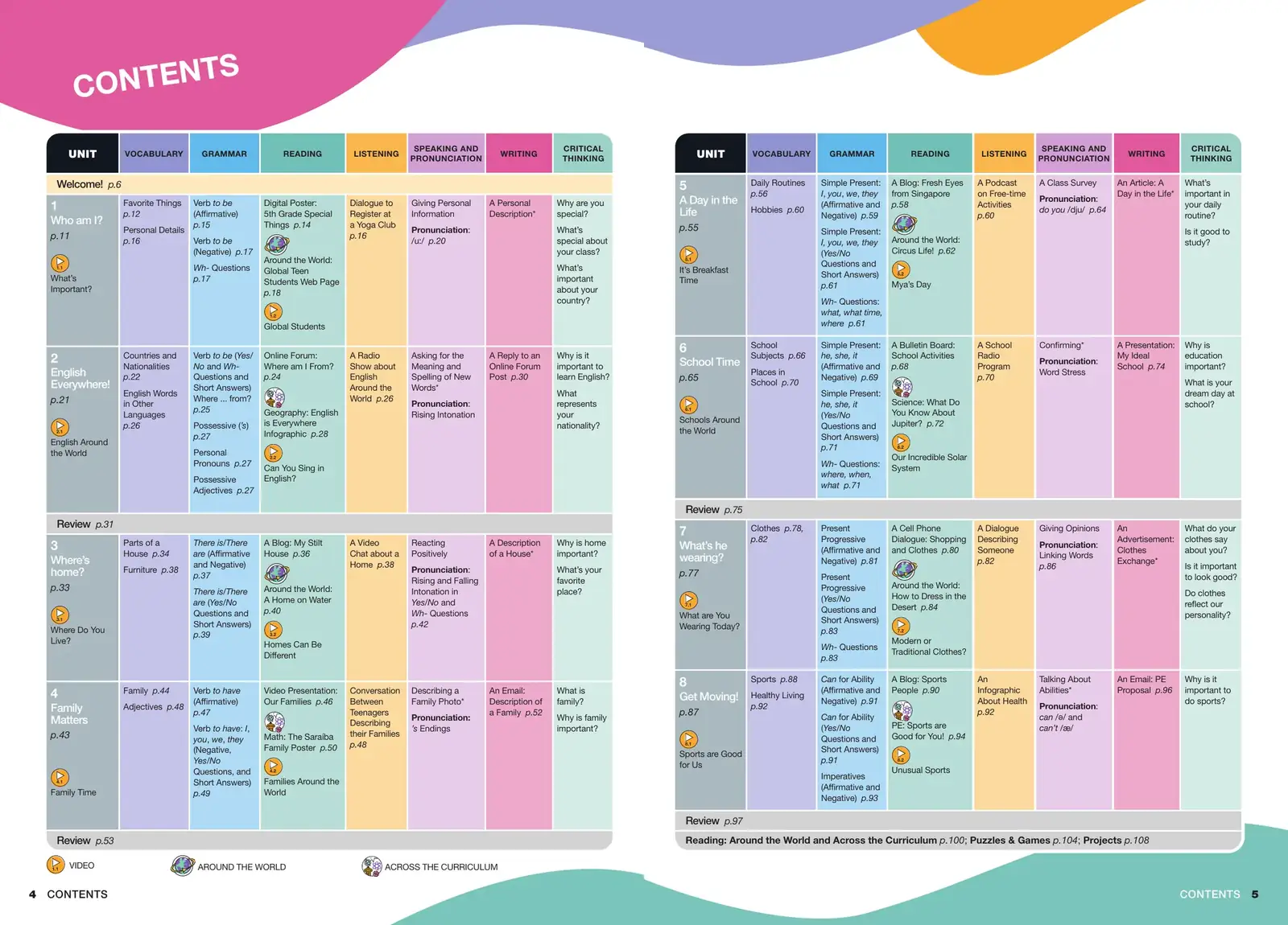
- 01Vocabulary
- 02Grammar
- 03Reading
- 04Listening
- 05Speaking
- 06Pronunciation
- 07Writing
- 08Critical thinking
A textbook page has to manage multiple learning layers at once.
Hierarchy has to remain clear even when vocabulary, grammar, reading, activities, media references and critical-thinking tasks coexist on the same spread.
The design challenge was to make complexity feel navigable.
Eleven layers on one spread
Fig. 1.4 · Grade 5 · Unit 3 · pp. 38–39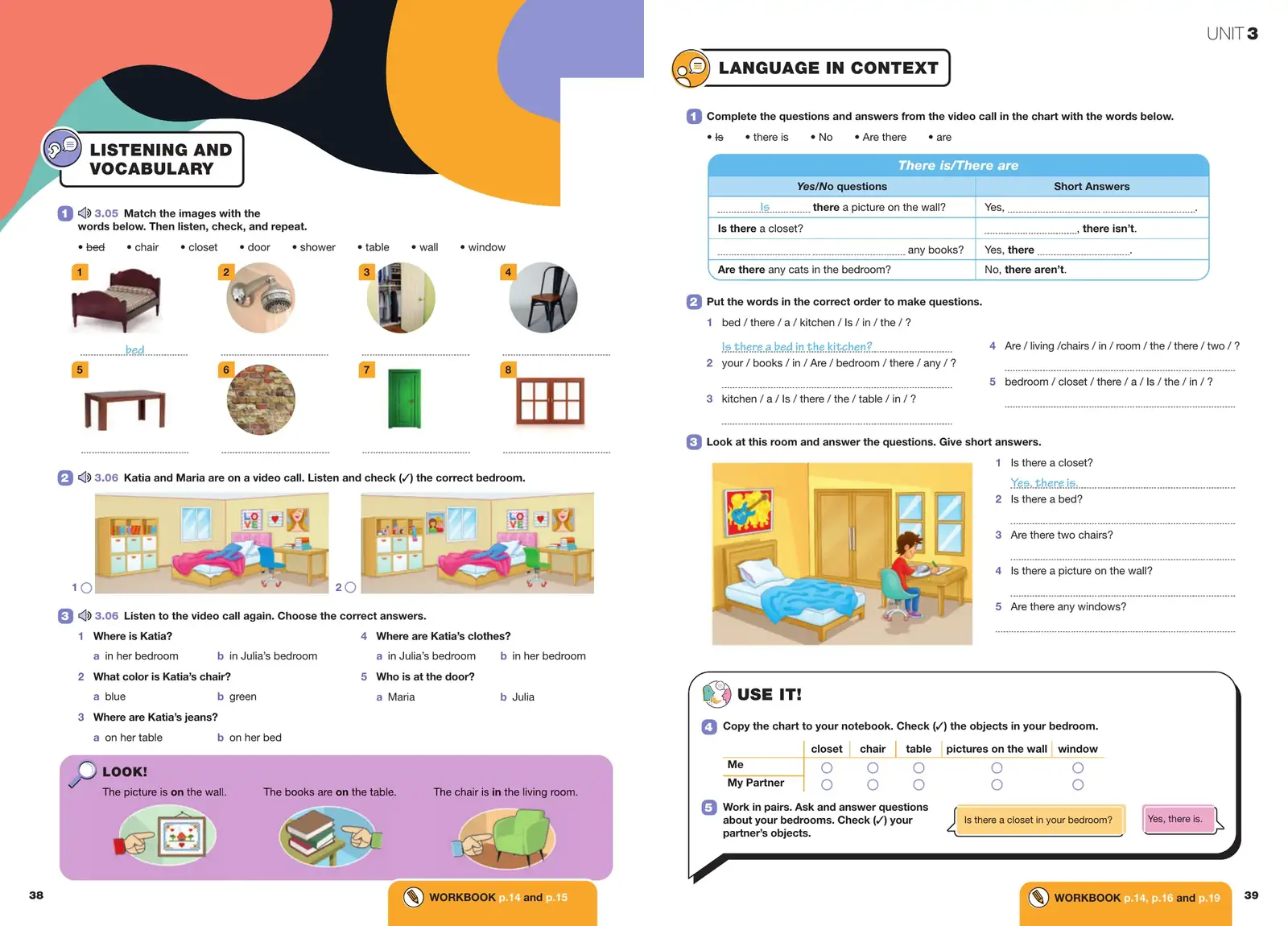
- 01Strand labelThe same badge system opens every lesson block, so the skill is named before the task.
- 02Audio cueTrack numbers tie the printed task to the classroom recording.
- 03Vocabulary gridEight numbered images on one module, answer line under each.
- 04Listening taskIllustrated options with tick boxes, kept at equal weight.
- 05LOOK!Grammar noticing in its own colour field, outside the exercise flow.
- 06Second strand on the facing pageLanguage in Context starts at the same height as the first.
- 07Grammar tableRule header in the strand colour; answer forms in a second tone.
- 08Image-supported questionsPicture and questions share one baseline grid.
- 09USE IT!Speaking production in a speech-bubble frame, the lesson’s end point.
- 10Workbook tabCross-reference anchored to the foot of every lesson page.
- 11Running head and folioUnit marker and page numbers keep 120 pages navigable.
Real spreads, from unit opener to grammar reference.
Unit opener
Fig. 1.5 · Grade 5 · Unit 5 · pp. 54–55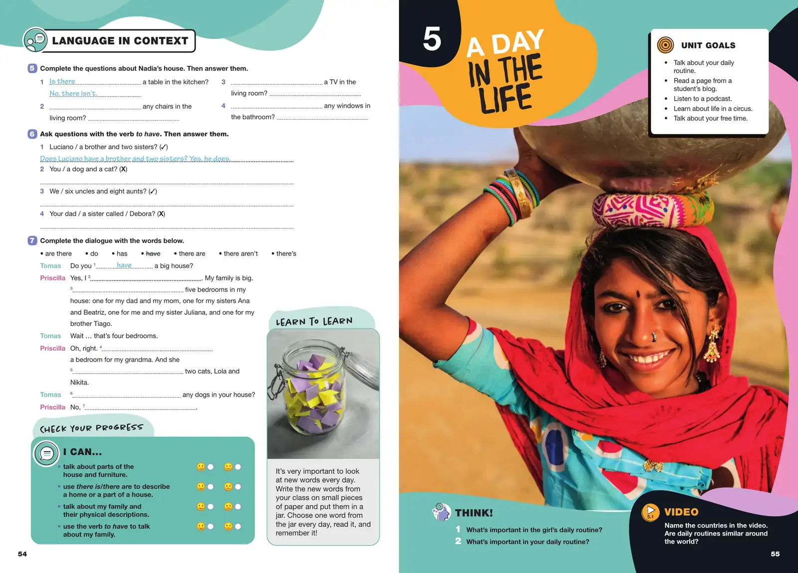
The unit closes with a progress check on the left; the next unit opens on the right with one full-bleed image, unit goals, a THINK! question and a video prompt.
Close crop · Fig. 1.6
Type, number and colour, set by unit.
Unit number, display title and the Unit Goals panel lock into the same positions on every opener in both grades.
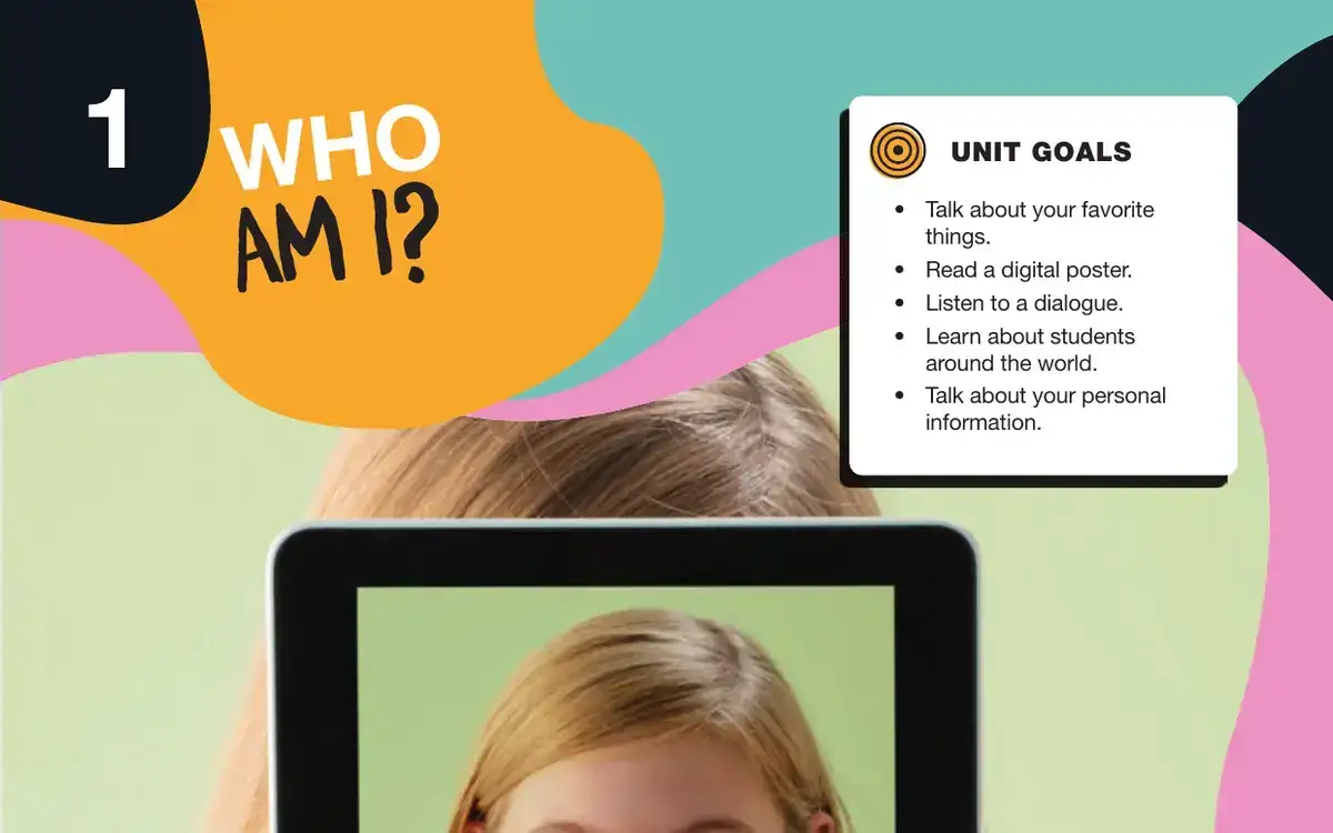
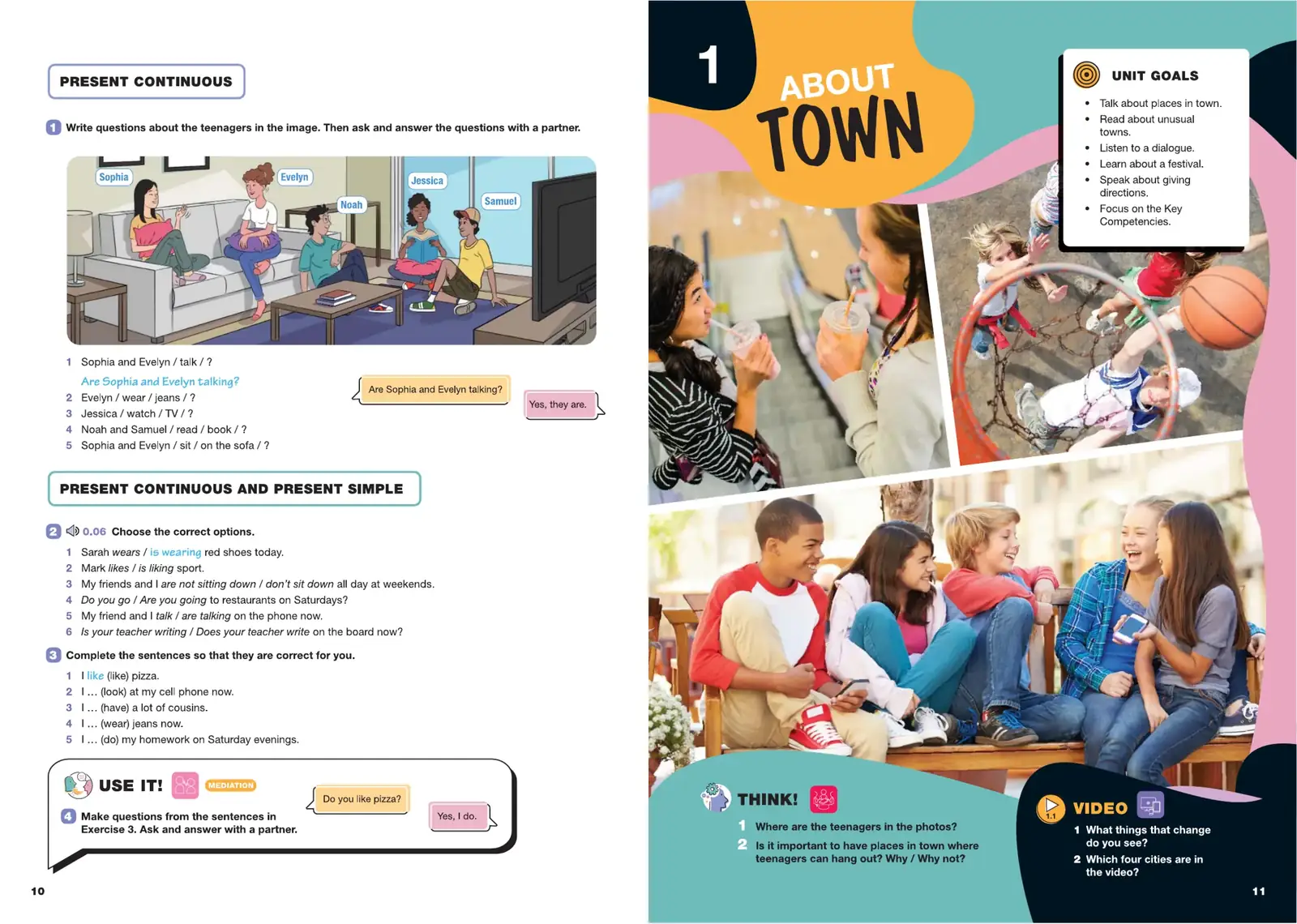
Image-led spread
Fig. 1.7 · Grade 6 · Unit 1 · Around the World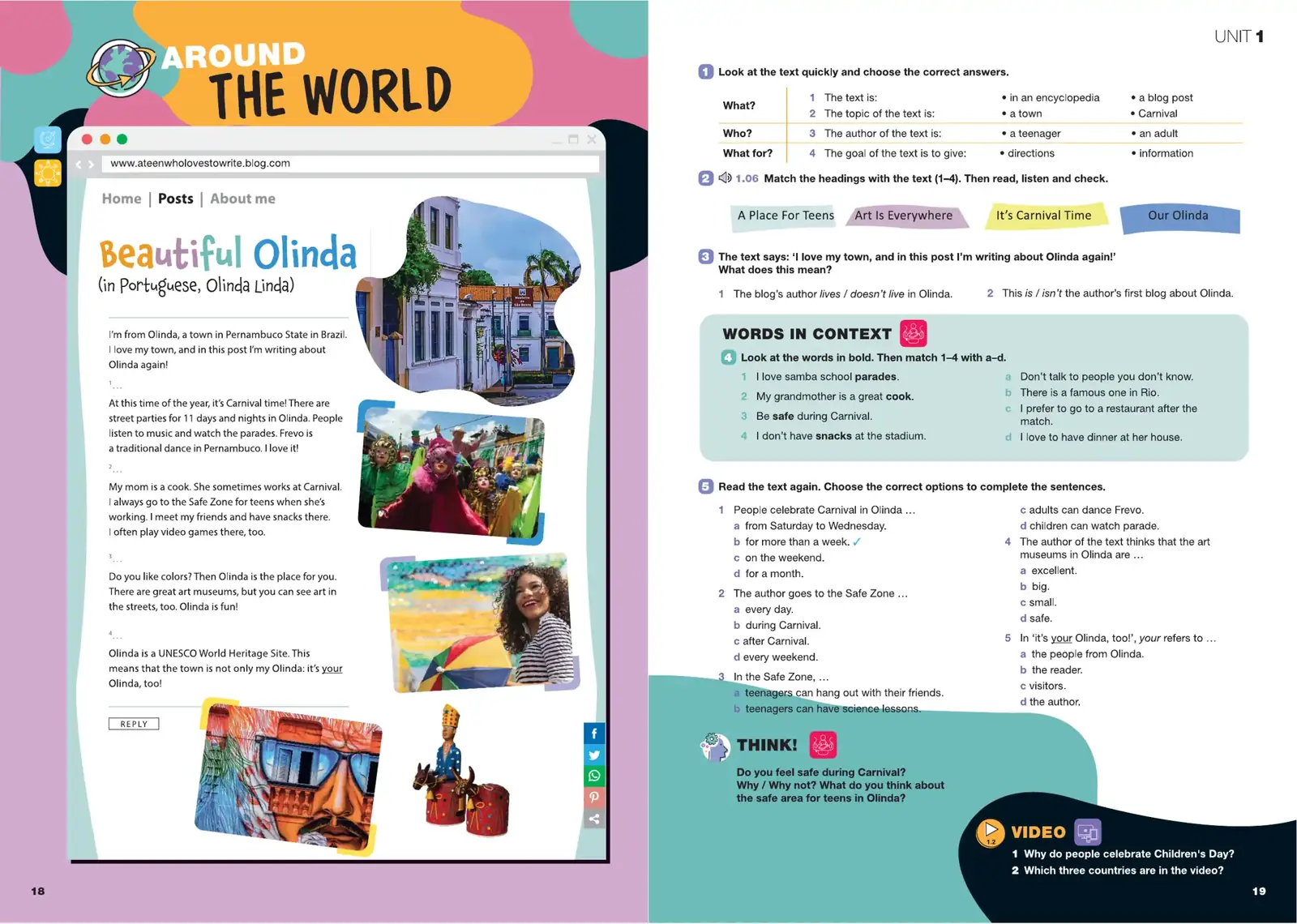
A reading text styled as a blog post. The page frame changes, but the strand label, task numbering and THINK! / VIDEO footer stay fixed.
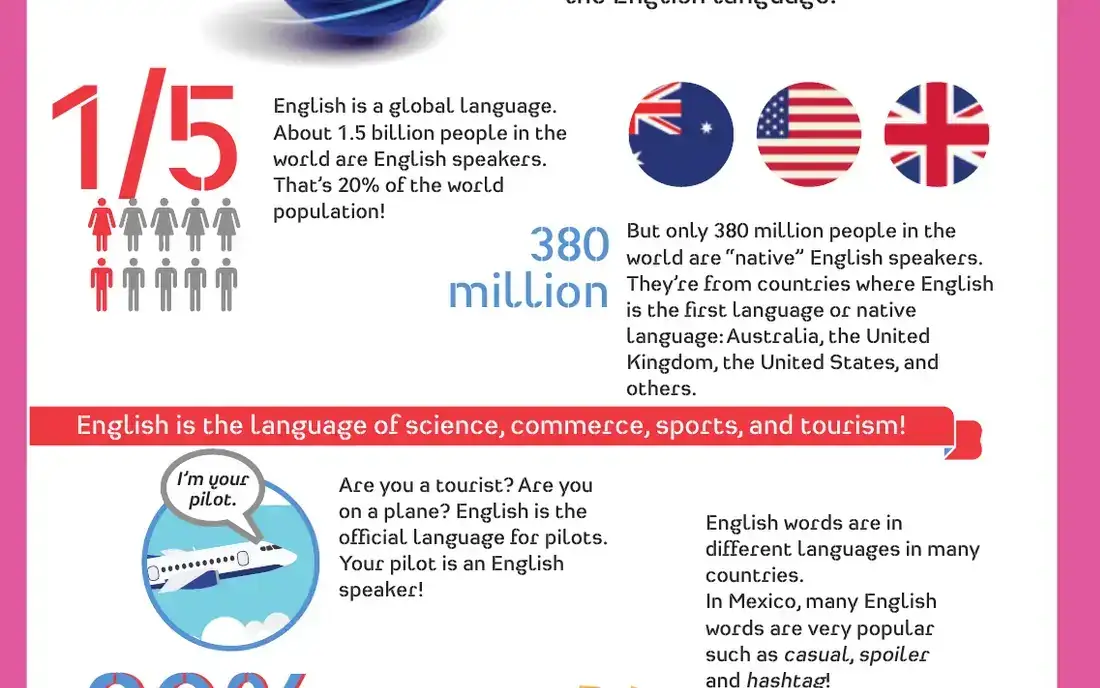
Typographic detail · Fig. 1.8
Data, set for an eleven-year-old.
Across the Curriculum, Geography. Large figures carry the facts; short body text explains them.
Dense learning spread
Fig. 1.9 · Grade 6 · Unit 2 · Across the Curriculum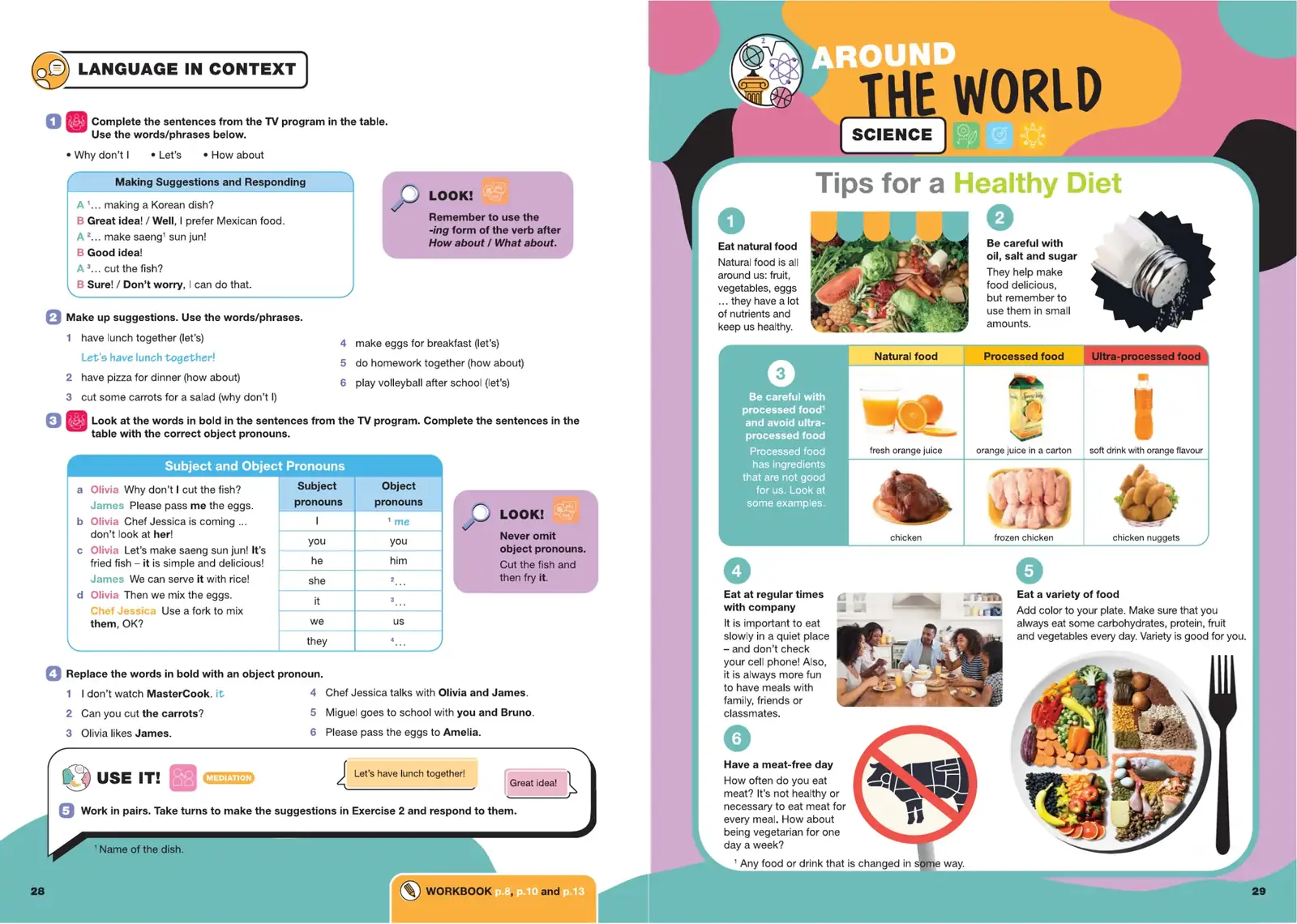
Exercise + review
Fig. 1.10 · Grade 5 · pp. 30–31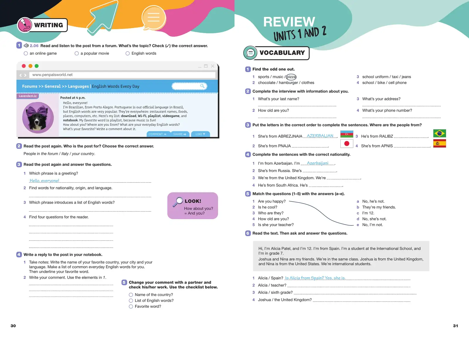
Unit opener, Grade 6
Fig. 1.11 · pp. 22–23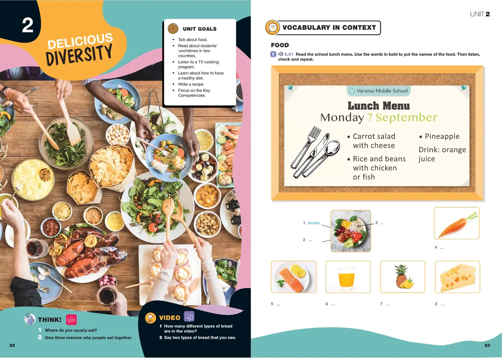
Reference and extras
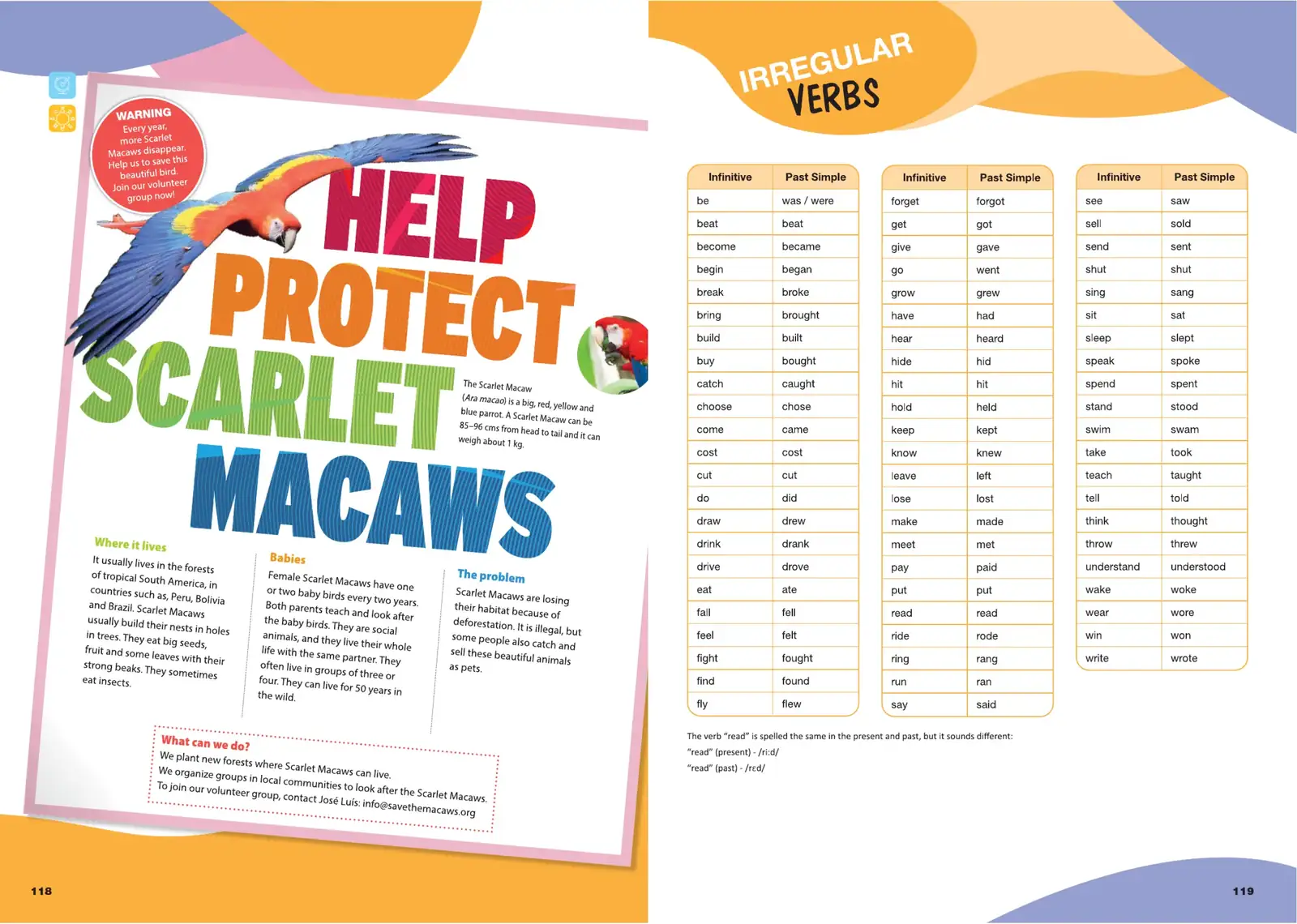
Fig. 1.12 · Grade 5 · Verb list and grammar reference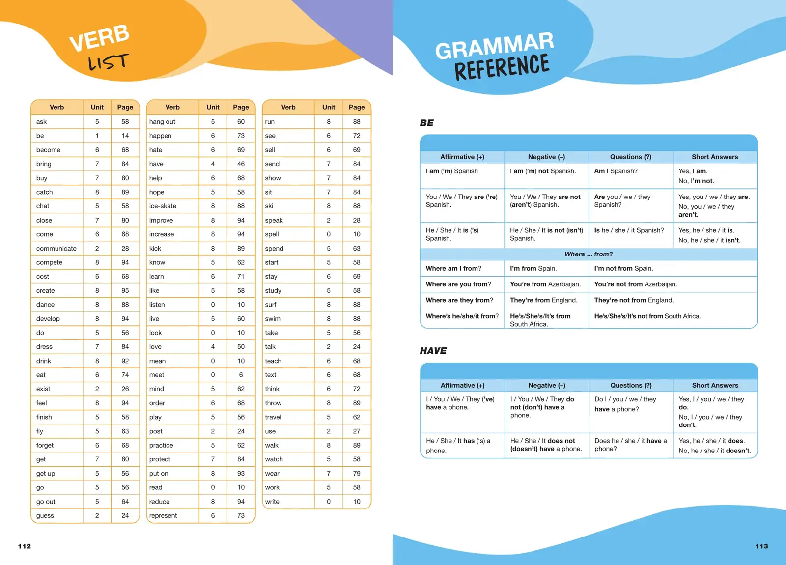
Localisation
is also design.
The visual system had to survive localisation.
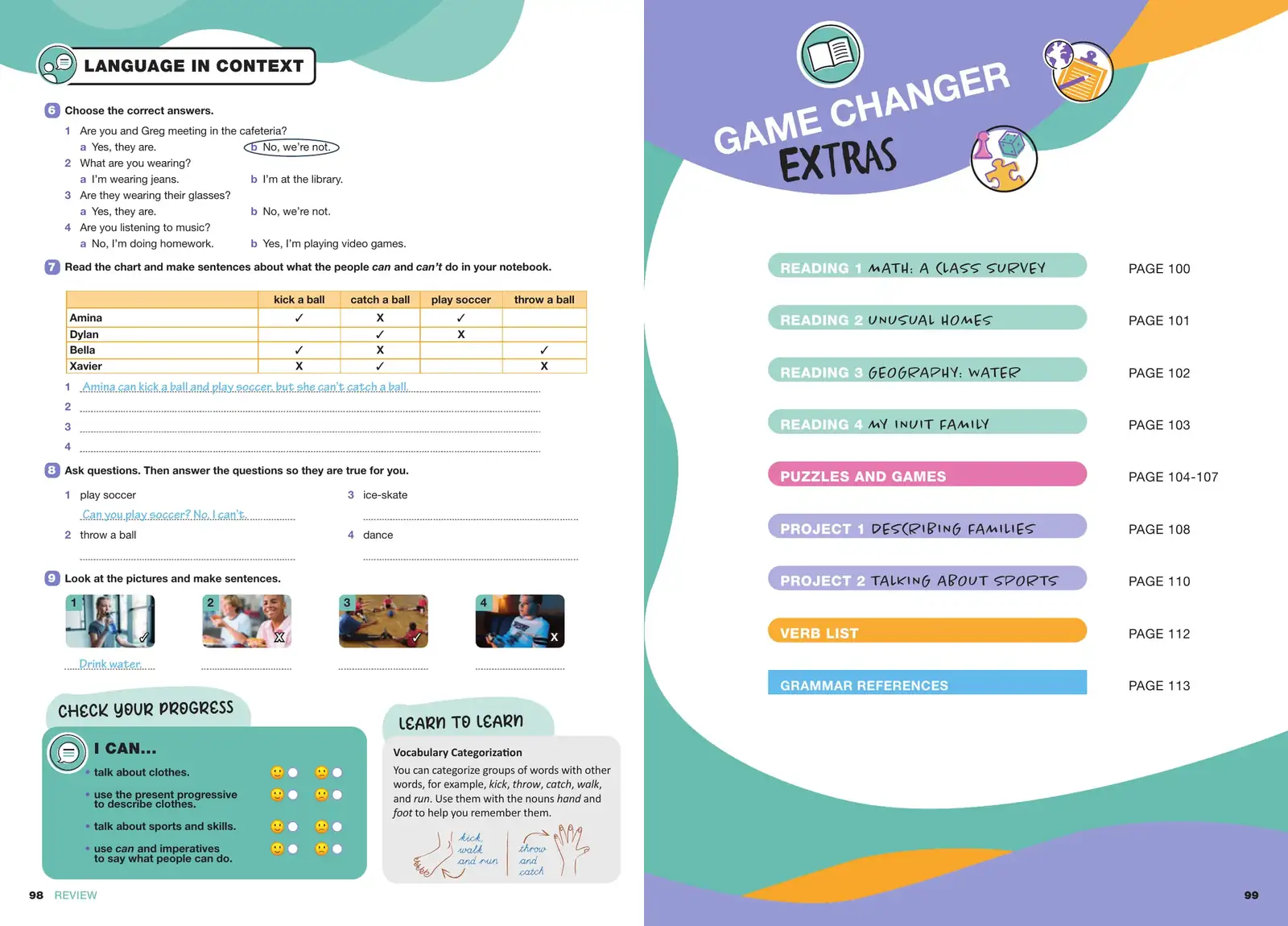
Every local element had to sit inside the original grid, label system and page rhythm: national front matter, local names and places inside exercises, grammar reference examples and an Azerbaijani imprint.
None of it could look added on. A student should not be able to see where Cambridge ends and the national edition begins.
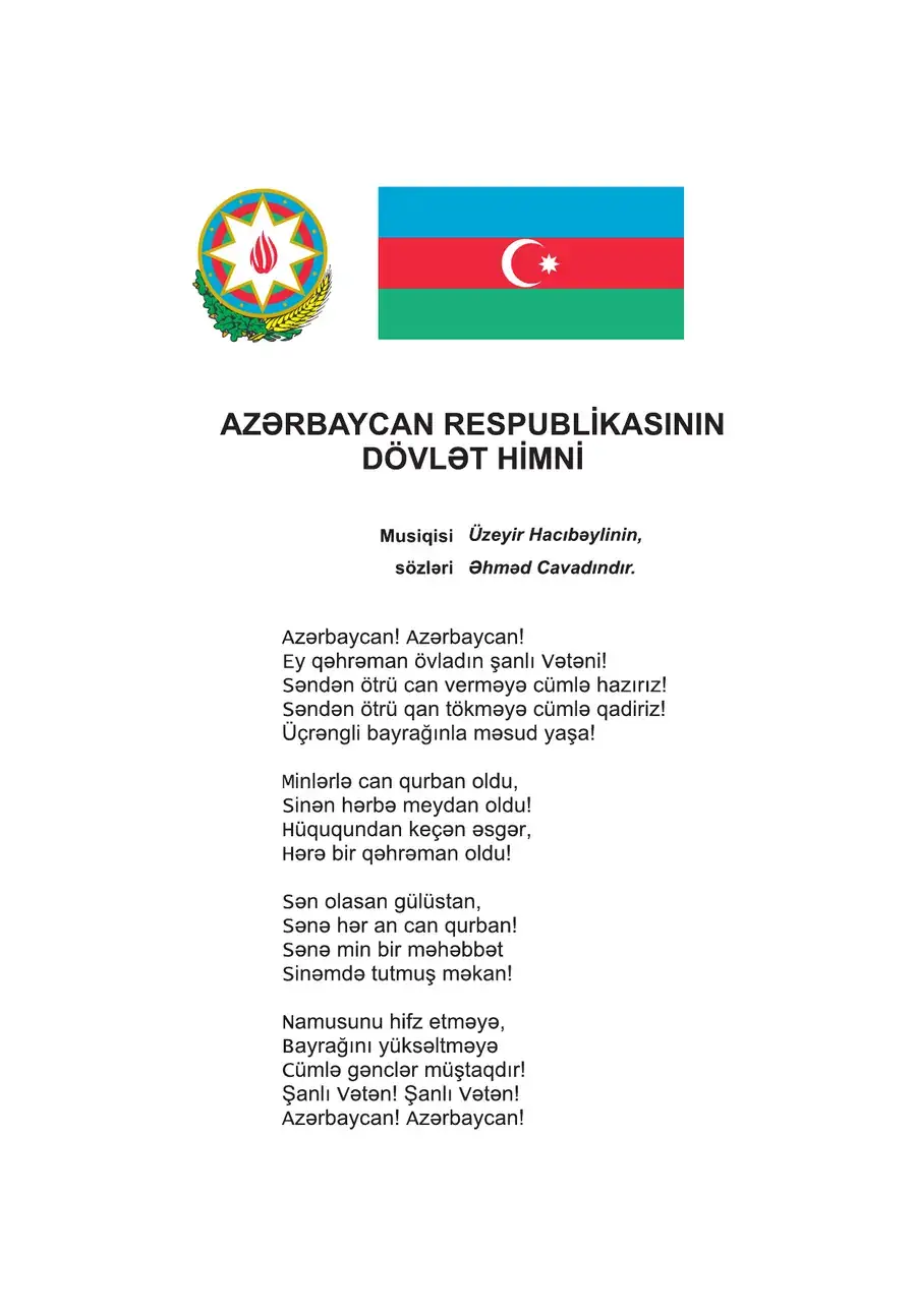
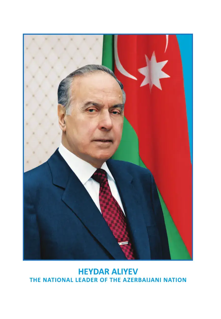
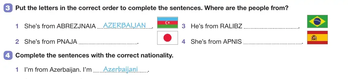
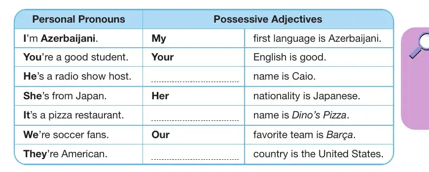
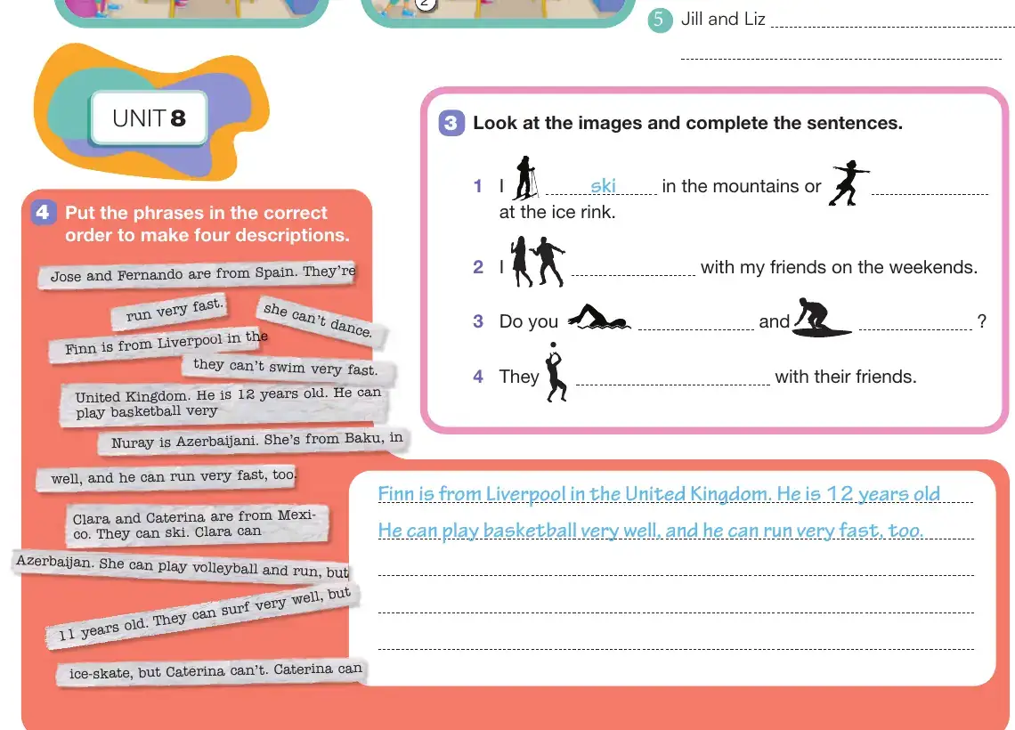
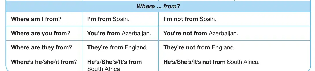
Local references appear as names, flags and example sentences. Each one keeps the type size, colour logic and spacing of the module it sits in: tables stay tables, puzzle strips stay puzzle strips.
Same system, two school years.
Grade 5 · 2024 / Grade 6 · 2025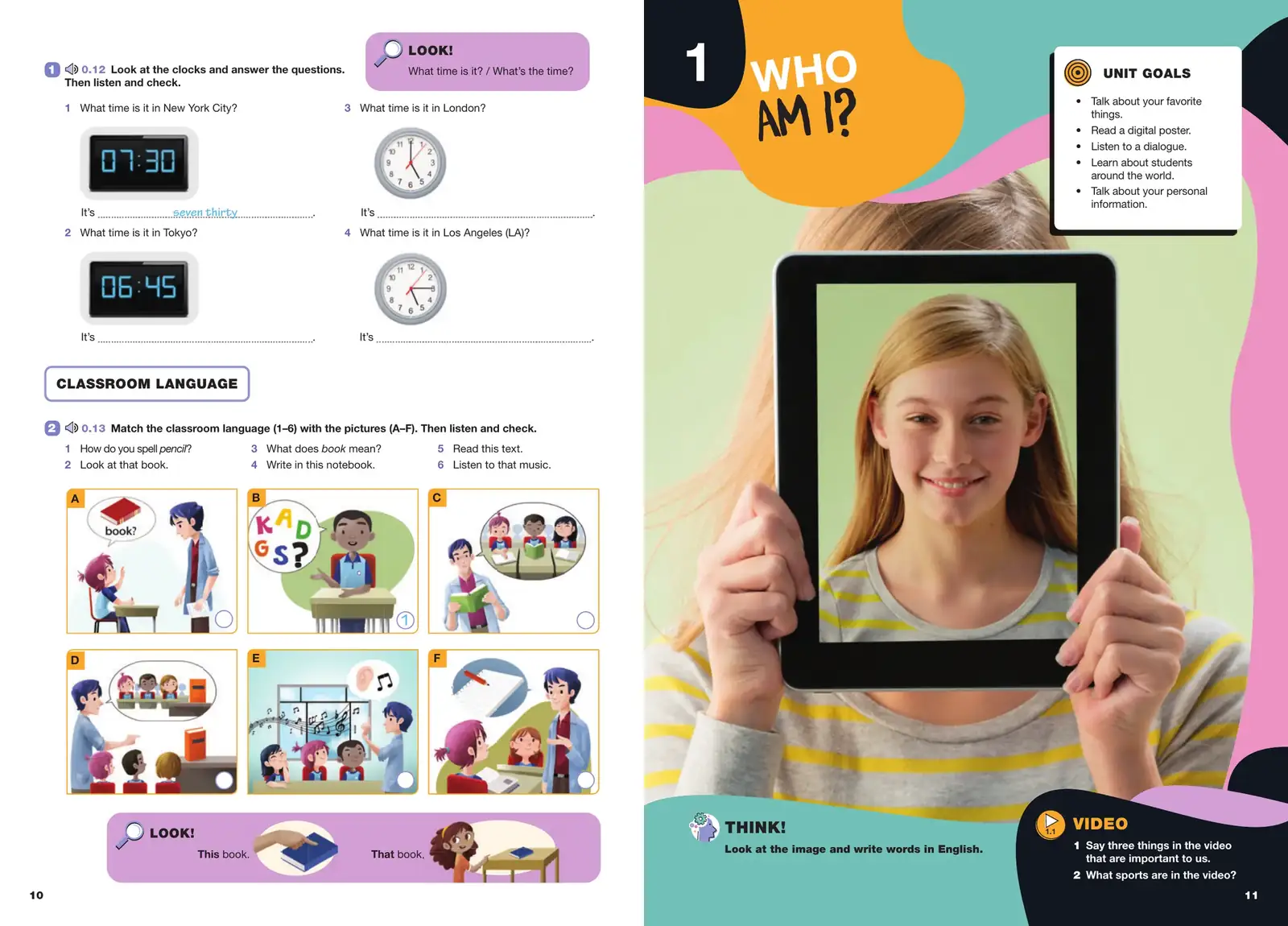
A presentation
has an audience.A textbook
has a generation
of readers.
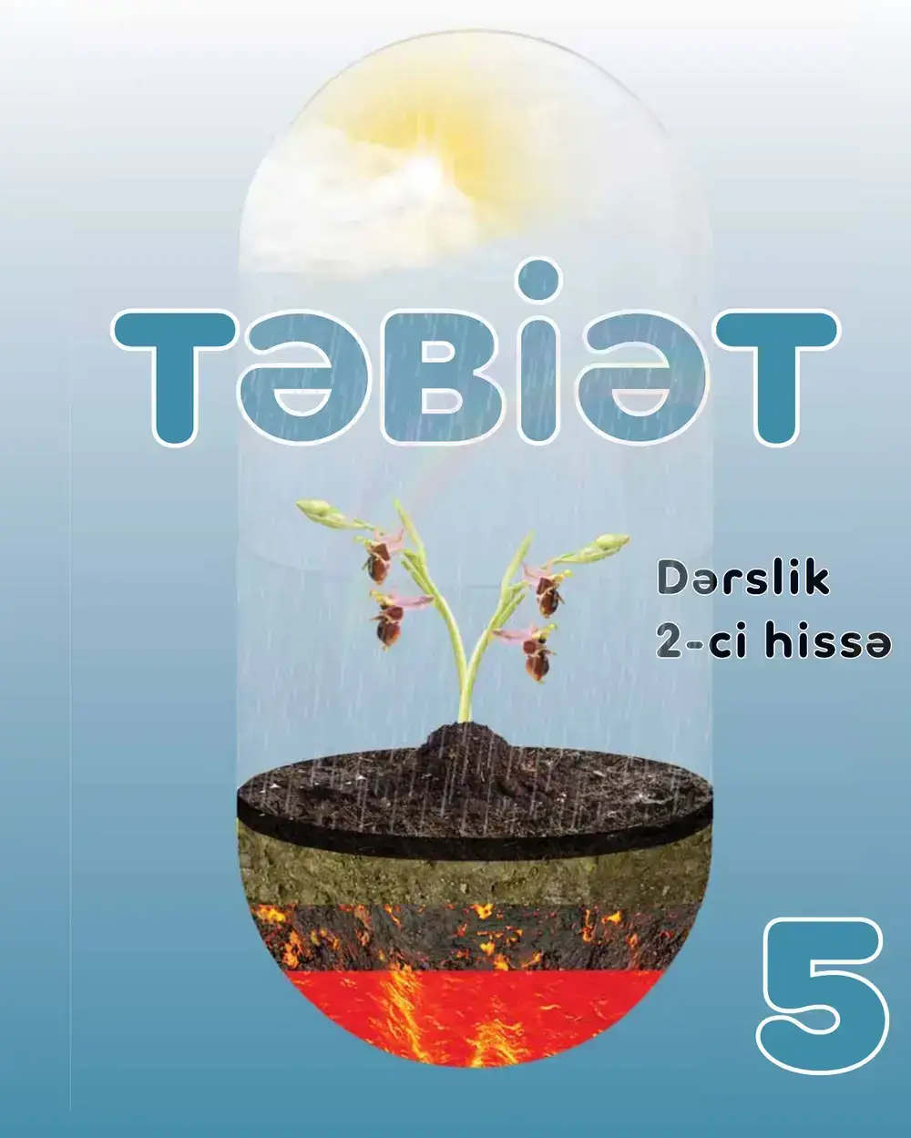
Təbiət 5
Designed for the classroom.
Built for learning.
Educational design has a different responsibility.
The page has to attract a child’s attention, but never compete with the lesson.
For the Grade 5 Nature textbook, the visual system combines illustration, diagrams, learning prompts and structured text to support students as they move from explanation to activity.
- Subject
- Nature (Təbiət) · Grade 5 · Part 2
- Editions
- Azerbaijani + Russian
- Format
- 96 pages · 220 × 275 mm
- Production
- Offset print · 2022 · distributed free
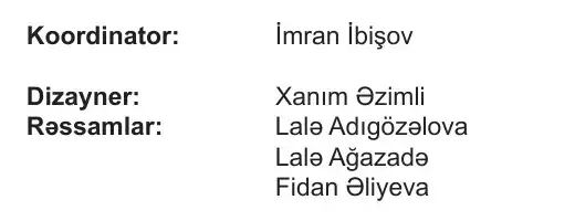
From the imprint · Azerbaijani and Russian editions
Dizayner: Xanım Əzimli
Designing for
young readers.
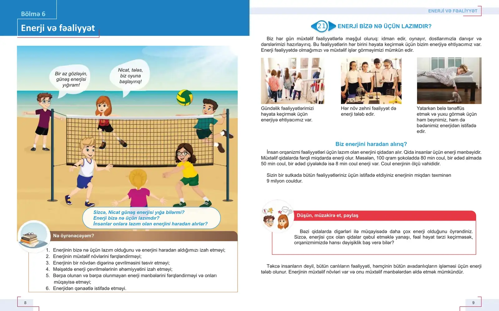
Notice
The page must attract attention.
- 01Section tab in a solid colour field, readable from across the desk.
- 02A large illustrated scene opens the section before any text.
- 03Opening questions sit inside the picture, in the students’ own voice.
Understand
Information must be easy to locate and follow.
- 04“What will I learn?” lists the objectives under the opener.
- 05Numbered lesson heading, same position on every lesson page.
- 06Photo row with a caption under each image.
- 07Subheads phrased as questions break the text into steps.
Remember
Visual structure should support learning.
- 08“Think, discuss, share”: the same red block in every lesson.
- 09Running head and folio frame each page with corner brackets.
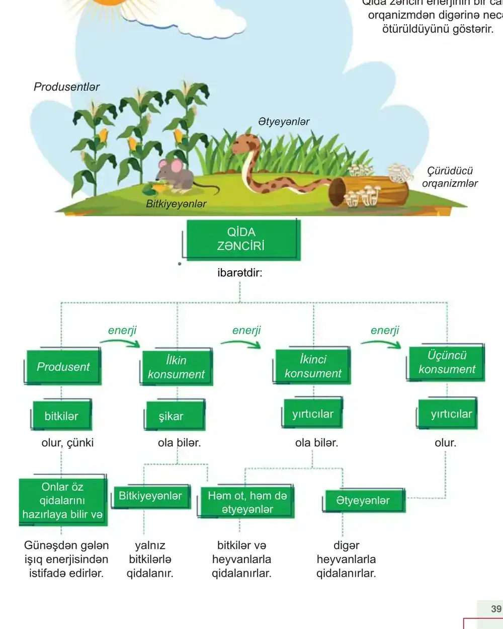
- ·Each section ends with a summary diagram (Fig. 2.6).
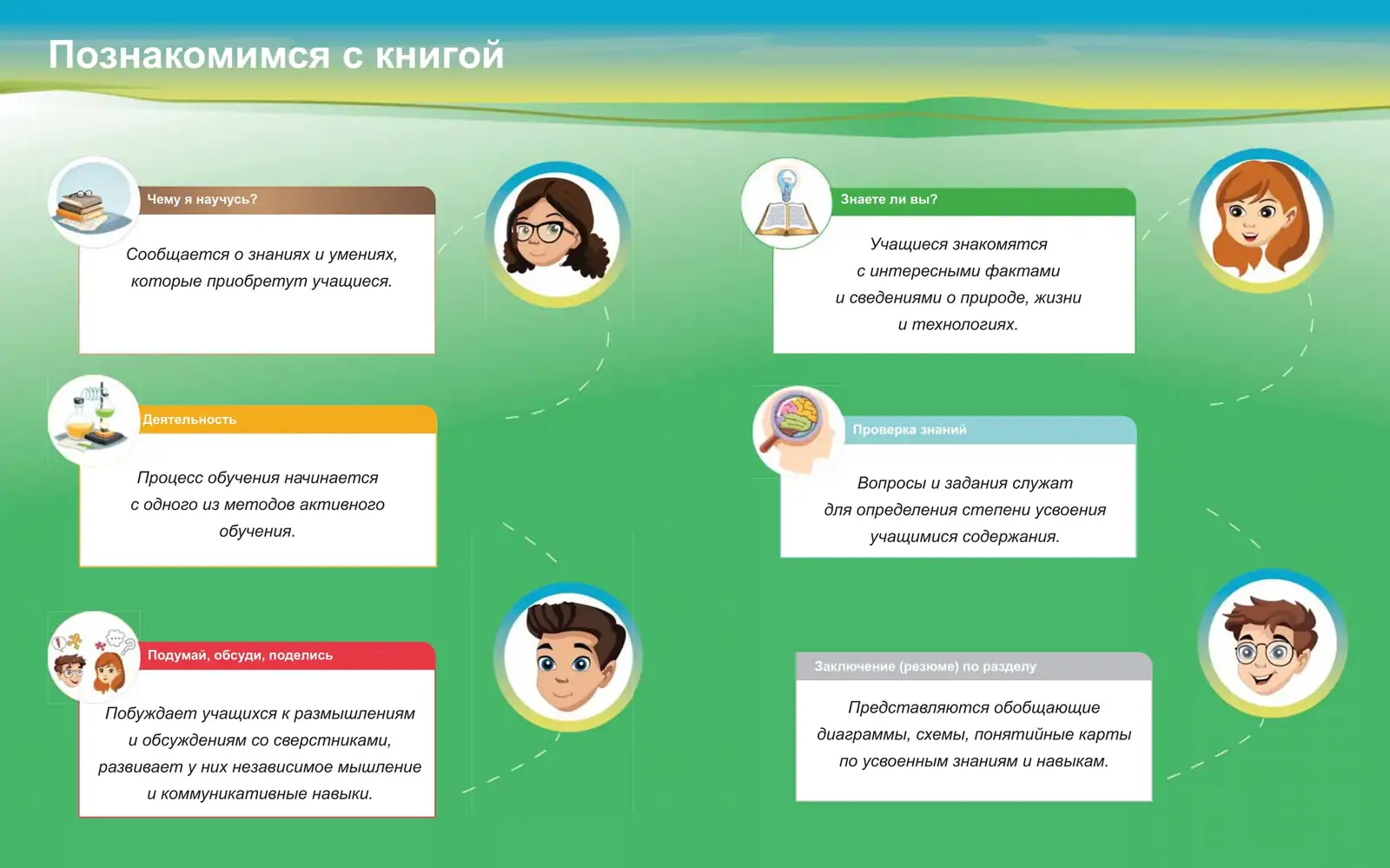
The book explains its own system
Fig. 2.3 · “Kitabla tanış olaq” · Let’s get to know the book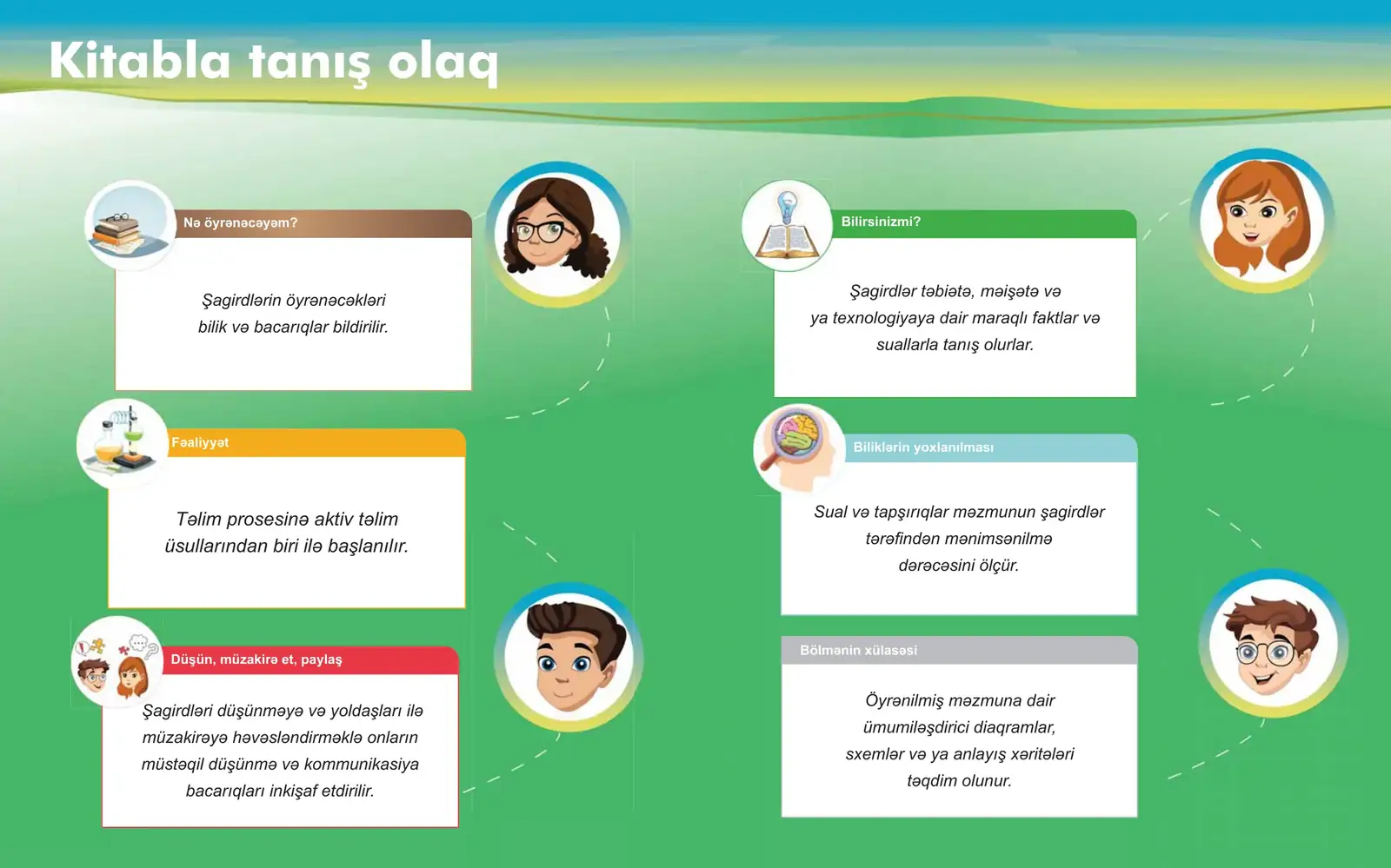
- Nə öyrənəcəyəm?What will I learn?
- FəaliyyətActivity
- Düşün, müzakirə et, paylaşThink, discuss, share
- Bilirsinizmi?Did you know?
- Biliklərin yoxlanılmasıCheck your knowledge
- Bölmənin xülasəsiSection summary
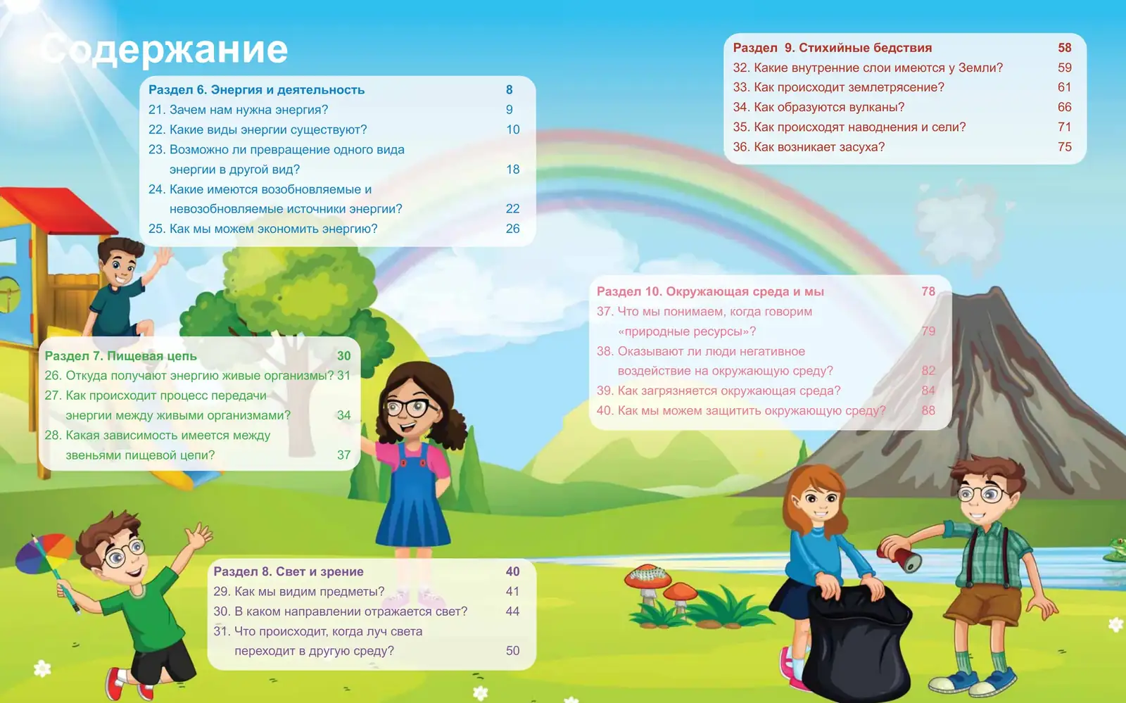
Contents
Fig. 2.4 · pp. 4–5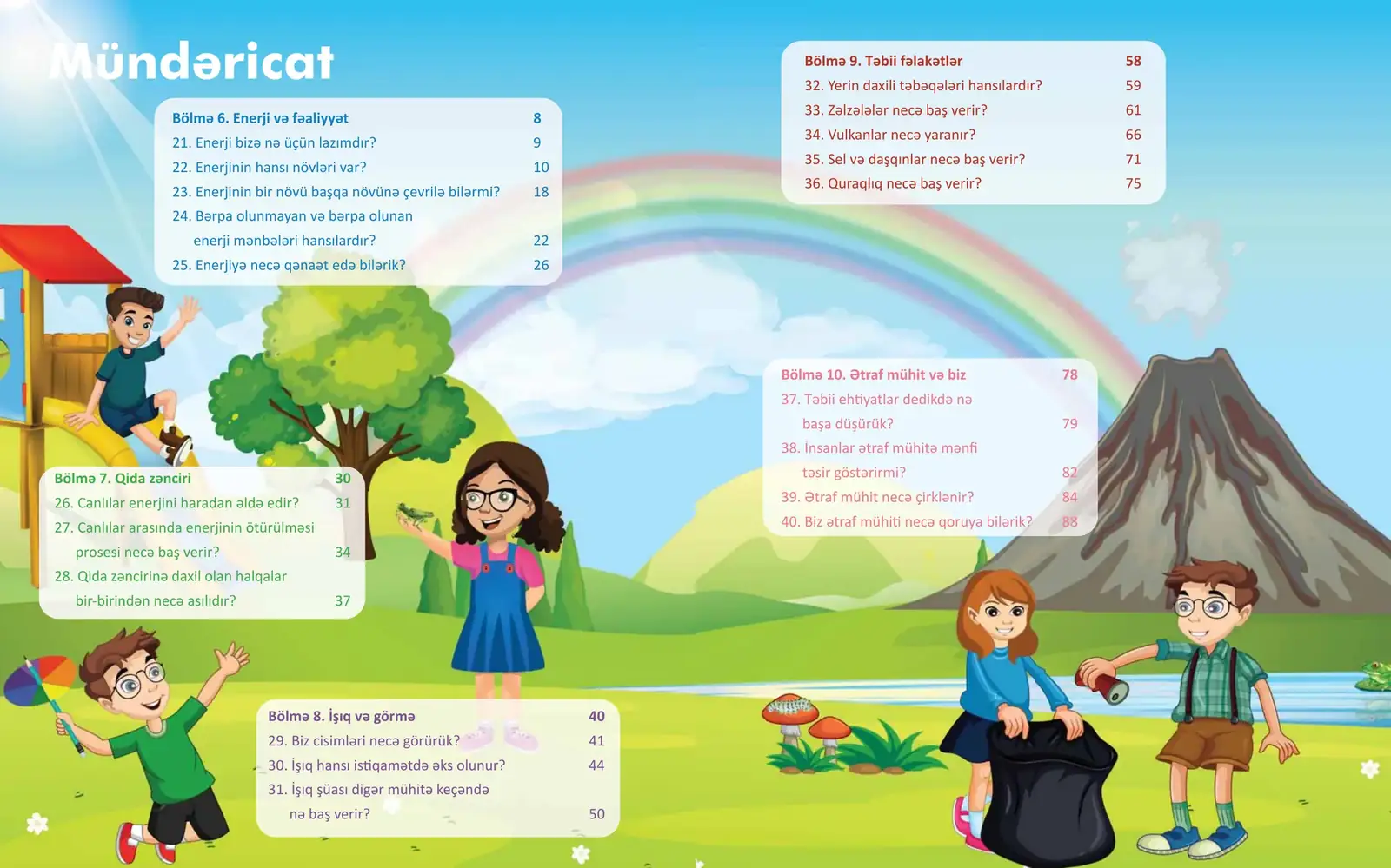
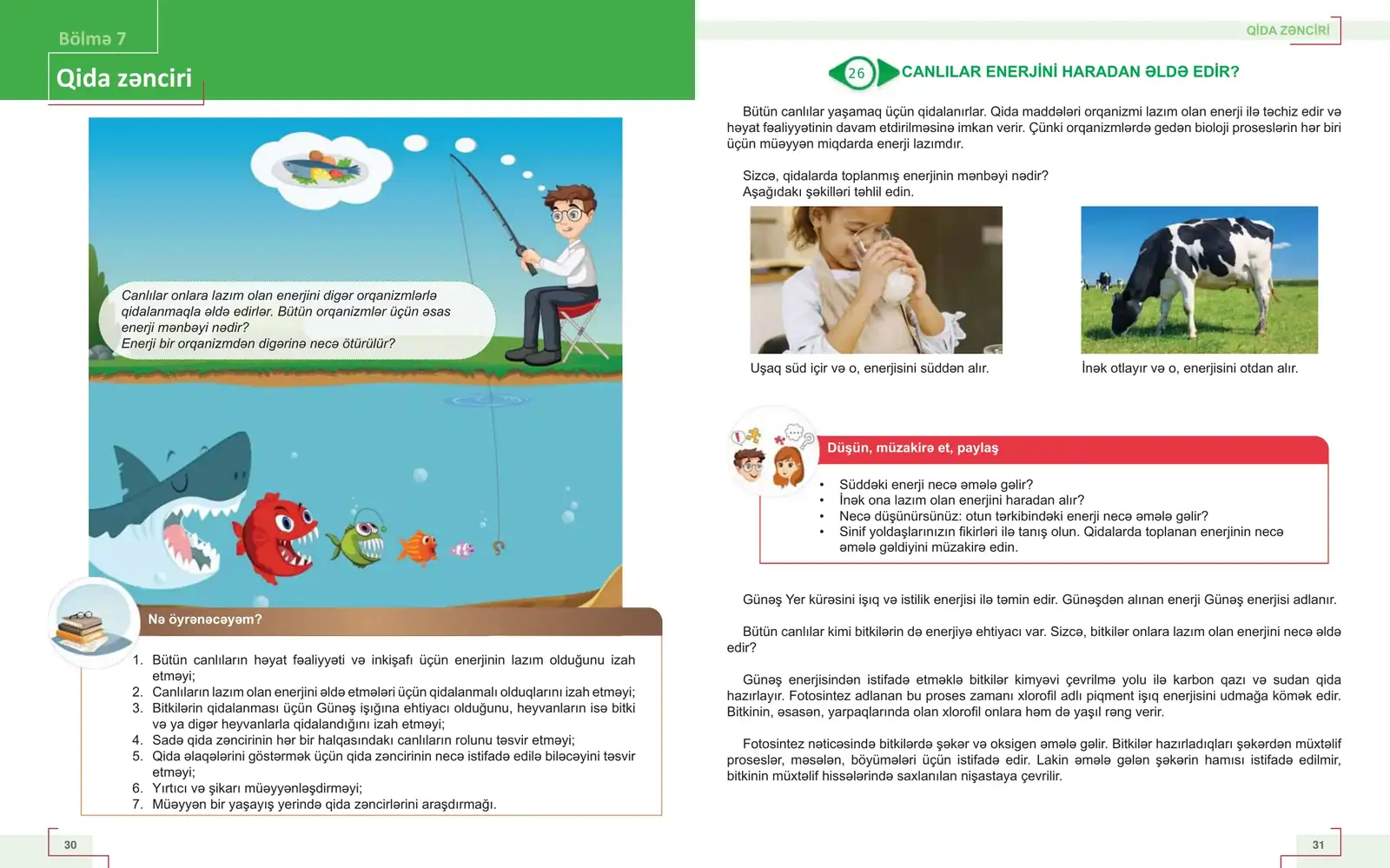
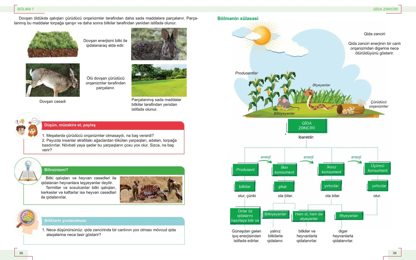
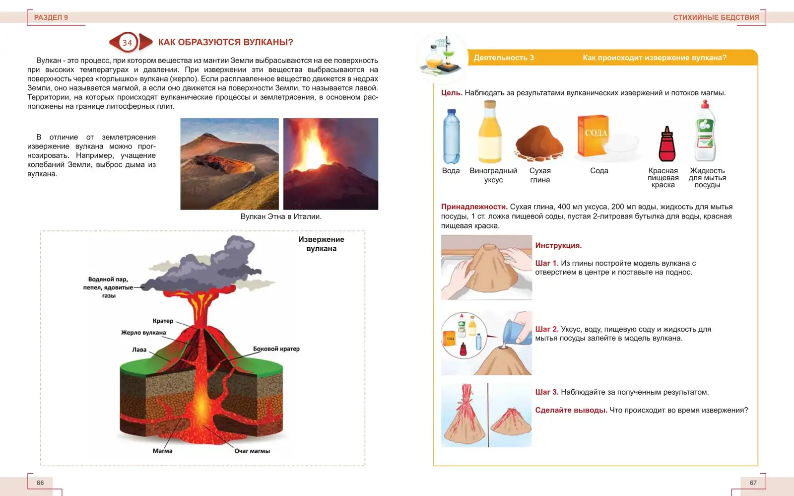
Diagram + activity
Fig. 2.7 · Lesson 34 · How do volcanoes form?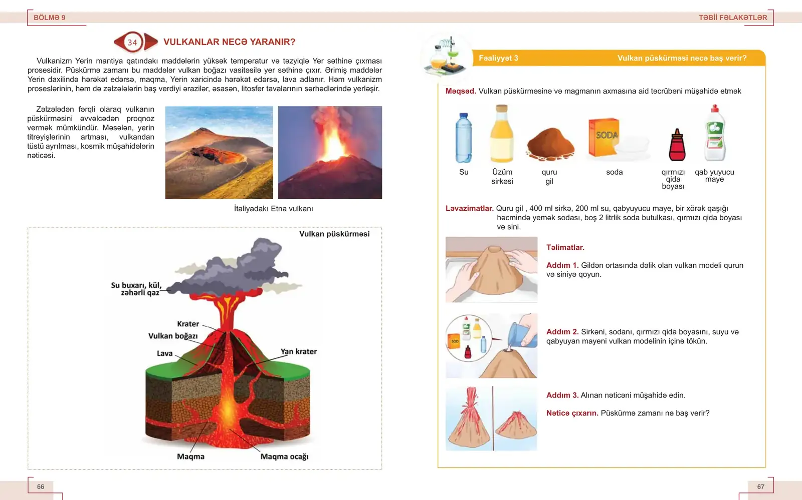
Explanation on the left, activity on the right: labelled cross-section, then a numbered experiment with materials, steps and a closing question.
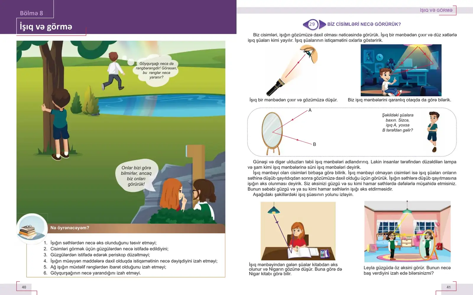
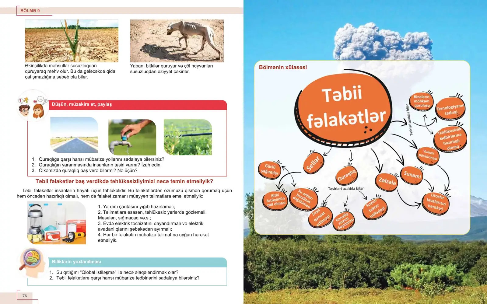
One system.
Two language editions.
Layout decisions have to hold when the language changes and the text gets longer.
Both editions share the same 96 pages, the same page numbers and the same position for every image, block and heading. Drag across the spread to switch between Azerbaijani and Russian on the same page.
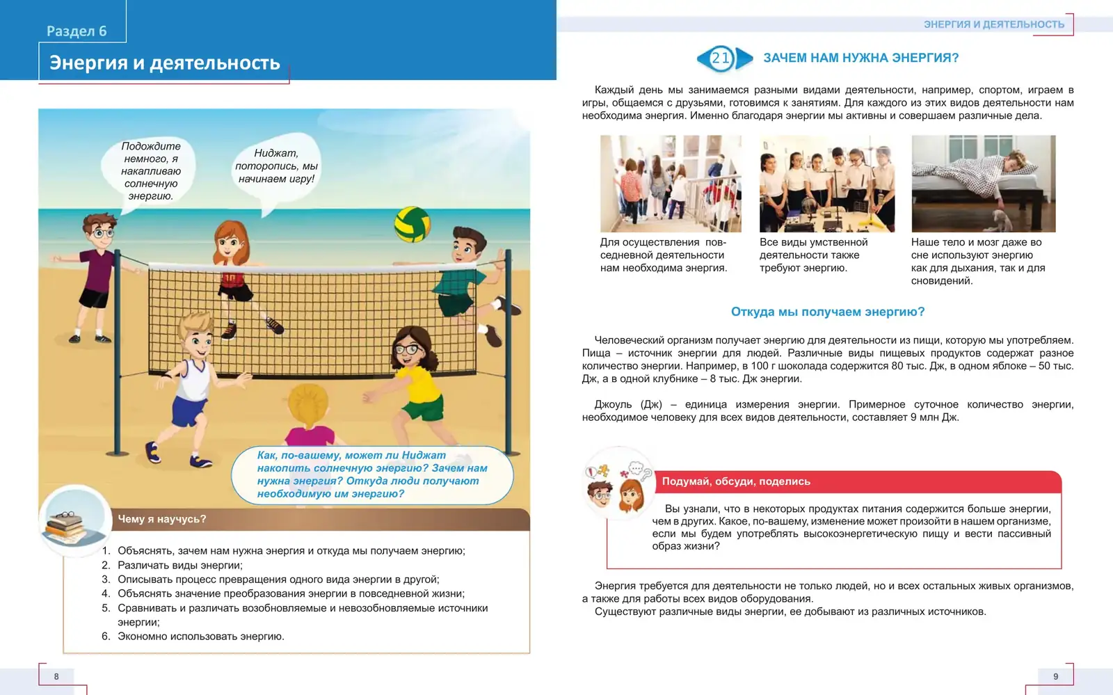
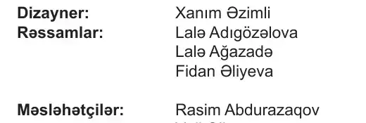
Russian edition imprint · translated, edited and proofread as its own edition
The Russian edition had its own translator, editors and proofreader. The design credit stays the same: one visual system carried across both editions.
The software
is in the pages.
Long-form layout
- Master pages: running heads, folios, corner brackets
- Grid systems held across 96–128 pages
- Paragraph and object styles for every recurring block
- Consistent pagination across two language editions
- Multi-page, print-ready production
Vector graphics
- Diagrams and flow charts
- Labels, tabs, badges and info-block frames
- Page graphics and recurring vector elements
- Visual assets built to scale across editions
Print images
- Compositing, as on the Təbiət cover
- Image preparation for offset print
- Retouching and colour correction
- Full-bleed and cut-out image treatment
The same storytelling discipline, at book scale: visual systems that live across a hundred pages, multiple editions, multiple languages and large print runs. The work has to stay coherent at scale.
Adobe InDesignAdobe IllustratorAdobe Photoshop
One evolving
editorial
system.
TISA Yearbooks
Annual editorial designFive years
of turning
a school year
into a book.
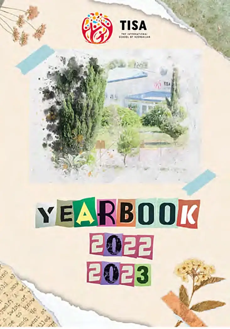
For five consecutive years, I designed the annual yearbook for The International School of Azerbaijan.
Every edition brought together an enormous mix of material: portraits, events, achievements, student life and graduation, in one publication that needed to feel both structured and personal.
This was not a one-off book design. It was an editorial system that had to evolve every year without losing continuity.
The challenge changed every year. The responsibility did not.
- 01Create a system.
- 02Organise the memories.
- 03Make the book worth keeping.
- Client
- The International School of Azerbaijan
- Publication
- Annual school yearbook
- Series
- Five consecutive editions
- Delivery
- One new book every academic year
- Covers
- Students, staff, events, milestones and the graduating class
- Readers
- Students, teachers and families
- Responsibility
- Concept, layout, photo selection and print-ready files
- 2022–2023 edition
- About two months from first page to print
One year.
Hundreds of moments.
One book.
- 01StudentsClass portrait pages, one framed grid per class
- 02FacultyTeachers inside the story, not in an appendix
- 03EventsFirst week of school, card making, trips
- 04Sport & playFun Friday, student-led games
- 05ArtsStudio moments, given their own frame
- 06AcademicsTOK presentations, DP coursework
- 07CommunityFood sale, International Day
- 08GraduationThe graduating class, set apart
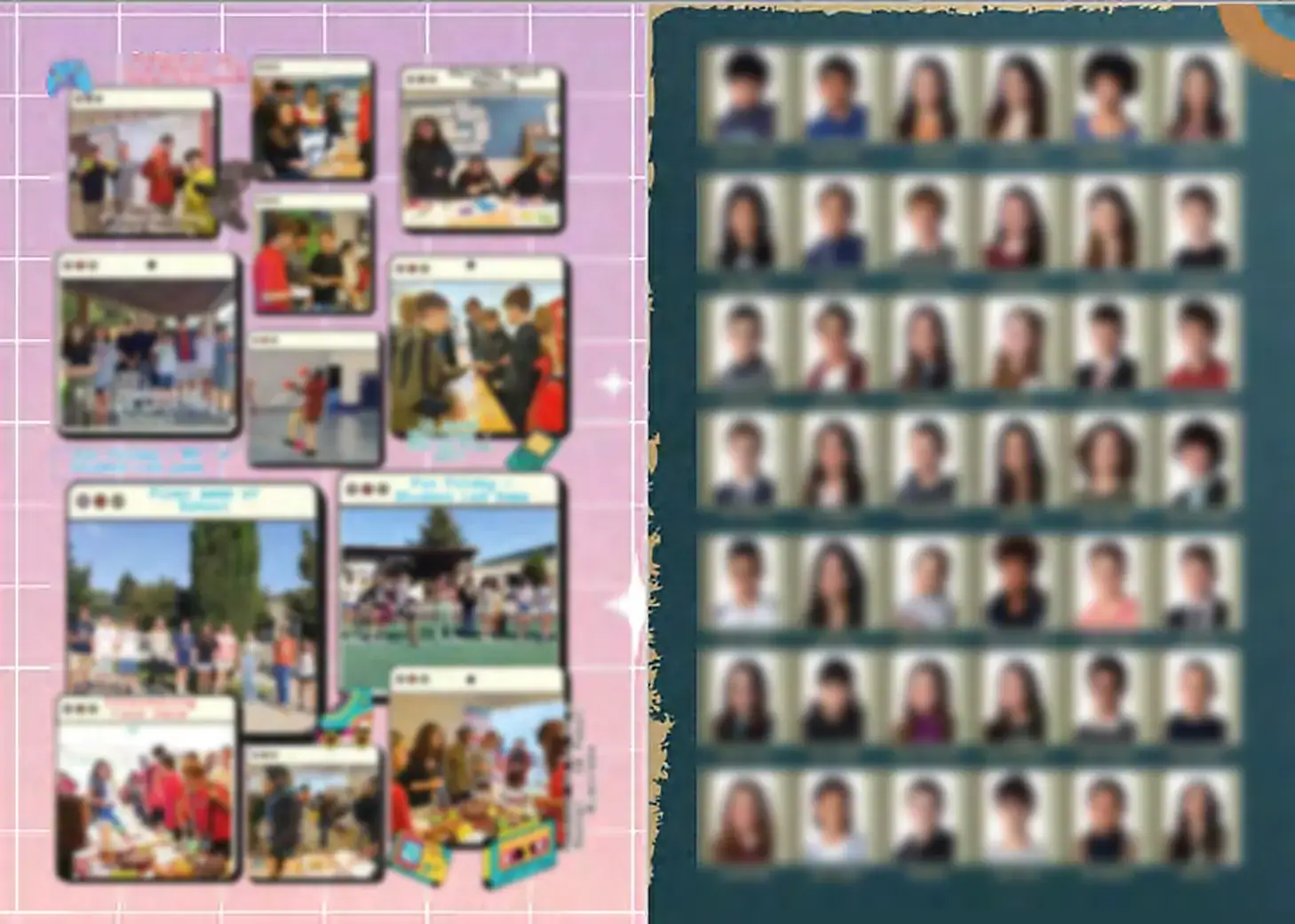
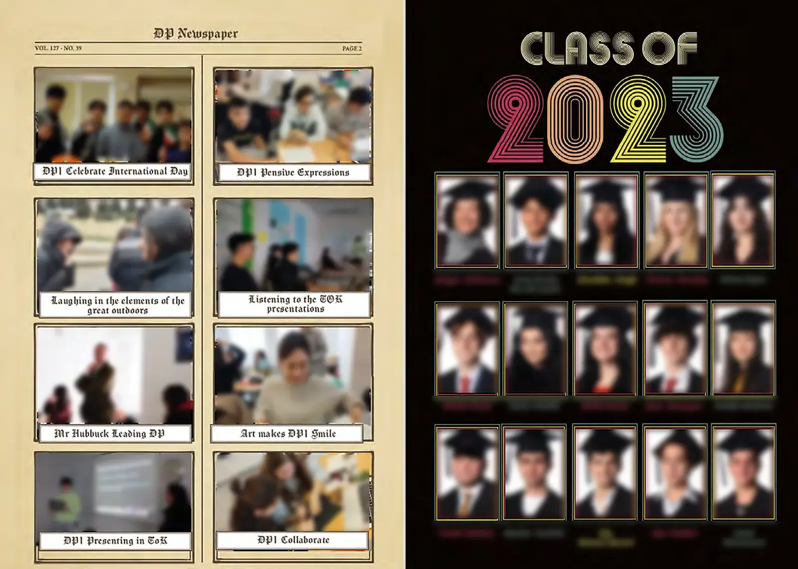
Student faces and names are softened on this page for privacy.
Consistency
without repetition.
- Its own cover
- Its own visual theme
- Its own photography
- Its own memories
- Editorial logic
- Readability
- Structure
- School identity
- Production discipline
Many voices.
One book.
Even inside a single edition, sections speak in different visual languages: scrapbook, newspaper, retro type. The frames, captions and portrait grids underneath stay the same, so the book still reads as one.

TISA Yearbooks · Scale
- 5 yearsOne relationship, renewed every school year
- 5 editionsA new book, a new theme, the same system
- Hundreds of momentsPortraits, events, milestones
- An entire school year in every bookFrom the first week to graduation
Designed for a year.Kept for years.
- Editorial design
- Art direction
- Page layout
- Photo curation
- Typography
- Print production
Adobe InDesign · Adobe Photoshop · Adobe Illustrator
Stage &
Culture.
Two productions. Two visual worlds.
Grease
The show started
before the stage.
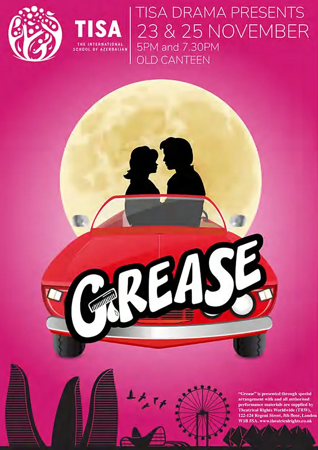


A theatre visual created for The International School of Azerbaijan’s production of Grease.
The project translated the character of the performance into a bold promotional identity designed to build recognition and anticipation before opening night.
- Role
- Poster design · Visual communication · Event promotion · Creative direction
- Production
- TISA Drama presents Grease
- Performances
- 23 and 25 November · 5 pm and 7.30 pm · Old Canteen
- Also
- Promo trailer for the show, video production and editing


Oliver! JR.
Victorian London.
Staged in Baku.
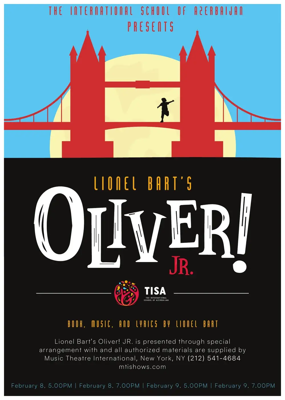
A programme is the first thing the audience holds.
It sets the scene before the curtain does.
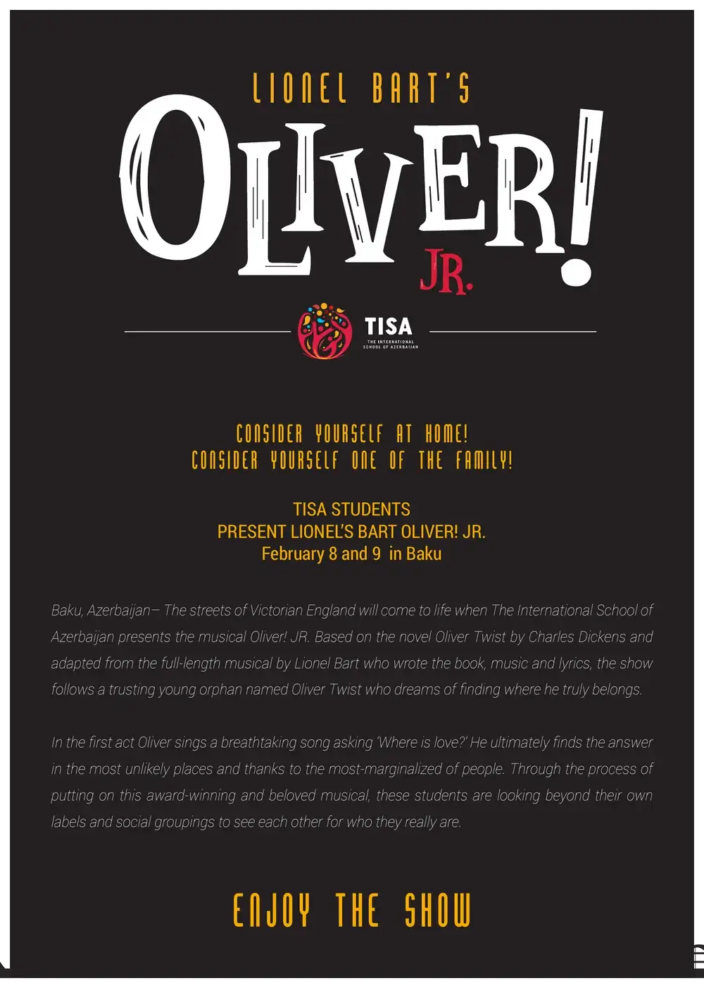
For the school production of Lionel Bart’s Oliver! JR., the programme carries one graphic idea through ten pages: Tower Bridge in red against a pale moon, condensed poster lettering, and a city skyline along the foot of every text page.
- Production
- Oliver! JR. · TISA students
- Format
- 10 pages · 216 × 303 mm
- Contents
- Cover, press notes, production team, musical numbers, two cast lists
- Performances
- 4 shows · 8 and 9 February
One bridge, two pages
Fig. 5.3 · pp. 4–5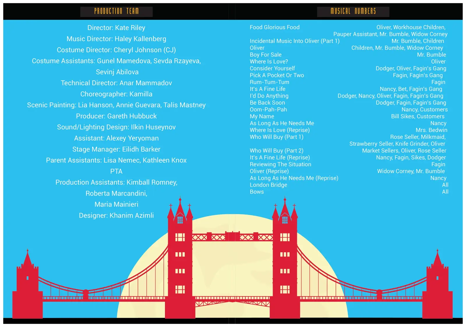
Production team on the left, musical numbers on the right. The bridge is drawn once across the gutter, so the spread reads as a single stage set.
Running footer · Fig. 5.4
London on stage. Baku underneath.
A skyline of Baku landmarks, from the Heydar Aliyev Centre to the Flame Towers, sits under every text page and ties the production to its home city.

Cast pages are not shown. The performers are students.

From the production team page
Designer: Khanim Azimli